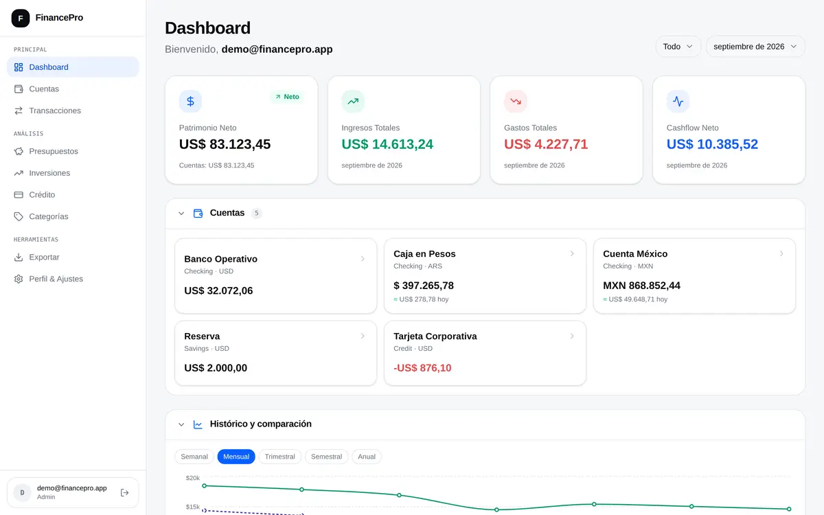
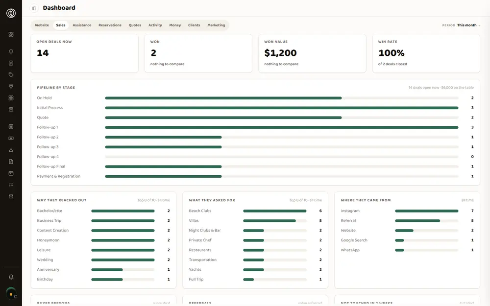
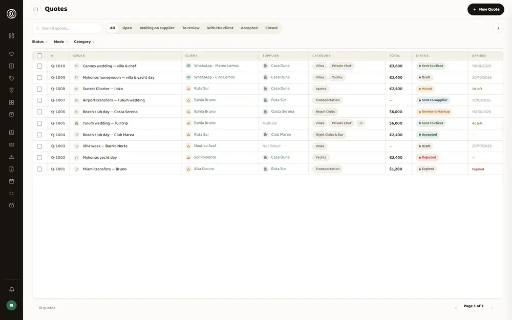
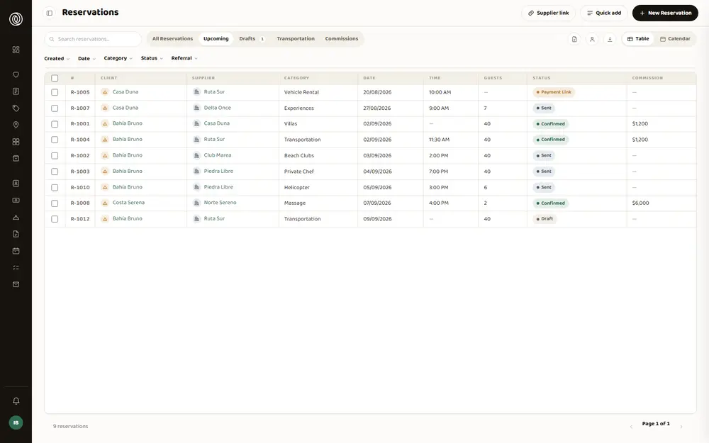
Una agencia de viajes de lujo coordinaba viajes enteros sobre un CRM pensado para vender, no para coordinar. Y un viaje no es una venta: es una docena de reservas que tienen que salir bien y en orden —el traslado del aeropuerto, la villa, el chef del segundo día, el yate, la mesa del sábado—, cada una con su proveedor, su horario y su comisión.
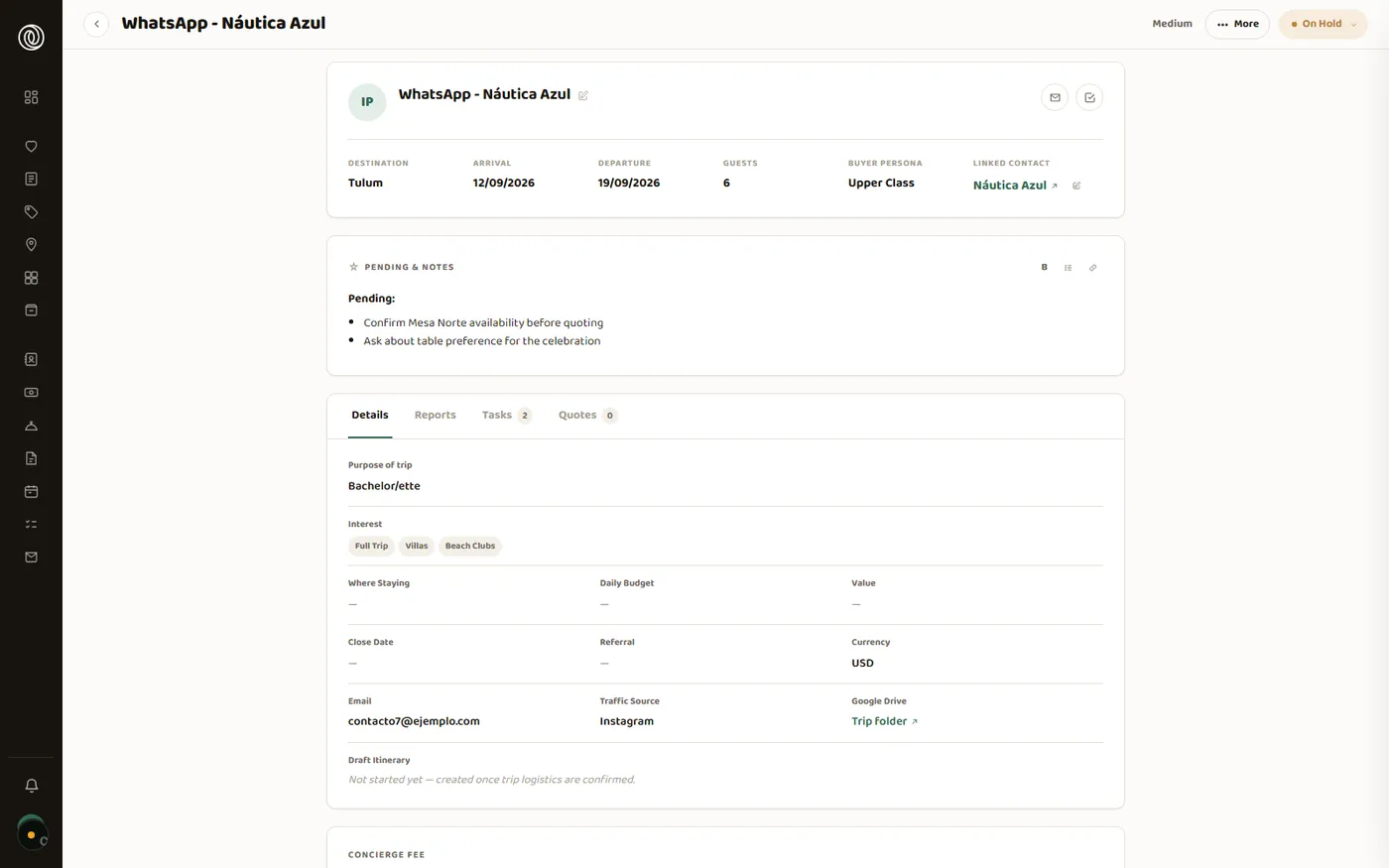
Nadie podía ver un viaje completo de una sola vez. Para saber cómo venía el fin de semana de una familia había que abrir su contacto, entrar a cada reserva y leer el cuerpo de cada mensaje. Construimos el sistema donde el viaje es el centro y todo lo demás cuelga de él.
Dar vuelta el modelo, aunque encareciera la mudanza. En el sistema anterior todo colgaba del contacto. Copiar esa forma hacía la mudanza de datos directa y barata; poner el viaje en el centro la volvía mucho más costosa, porque cada reserva necesitaba un viaje al que pertenecer y muchos de esos viajes no existían como registro: había que fabricarlos a partir de datos sueltos. Elegimos el modelo propio. Las 792 reservas quedaron con su viaje y su proveedor, sin una sola excepción.
Qué ve el cliente y qué se queda la agencia. Es la decisión de la que depende el negocio: si el itinerario muestra el nombre del chef o del chofer, el cliente puede saltear a la agencia la próxima vez y la relación con el proveedor —que es el activo— se regala. Pero si oculta el nombre del restaurante, el cliente no llega adonde tiene que llegar. Resolverlo caso por caso no escala con cientos de reservas cargadas por gente distinta. Escribimos una regla: el proveedor se muestra sólo cuando el cliente tiene que ir hasta él —un restaurante, una villa, un yate— y nunca cuando el proveedor viene hacia el cliente. Ahí el título es el servicio: la comida, la ruta, el tipo de vehículo.
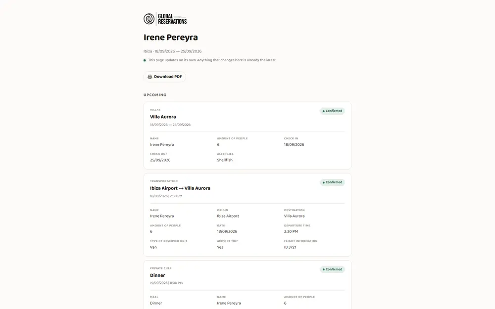
Un chef y un helicóptero no piden los mismos datos. Una villa pide entrada y salida; un traslado, origen, destino y número de vuelo; un chef, menú y alergias. Un sistema de mercado obliga a elegir entre un formulario único que no le sirve a nadie o un campo de texto libre donde cada uno escribe como quiere. Le dimos a cada categoría sus propios campos, y cada tipo de servicio lleva siempre el mismo color en todo el sistema. El dato dejó de ser una frase escrita a mano y pasó a ser algo que se filtra, se ordena y se suma.
Mudar ocho años de operación sin que el negocio parara un día. El riesgo no era perder un dato: era encender el sistema nuevo a mitad de camino y trabajar peor que antes. Auditamos la cuenta entera contra su respaldo antes de escribir una línea, corrimos la importación completa en seco —5.171 filas— y no encendimos nada hasta tener todo adentro y verificado. En el camino hubo reparación fina: 105 viajes venían partidos en dos fichas, 9 tenían el año mal tipeado —uno figuraba viajando hasta 2028— y 2 salían antes de llegar. Los tres casos quedaron corregidos antes de encender el sistema.
Que no se pareciera a un panel de control. Es un sistema que se abre a primera hora y se cierra a última. Descartamos la estética por defecto de toda herramienta interna —tipografía de sistema, grises, bordes— y usamos fondo de papel, un solo color de acento y la tipografía de la marca de la agencia en todo el sistema, también adentro de las tablas.
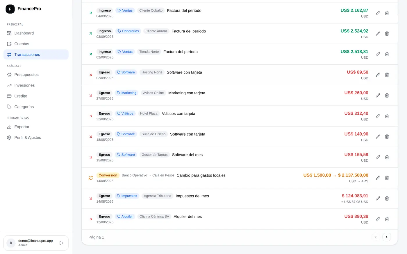
Una fila de tabla nunca tiene dos renglones. El estado va en un color o en una pastilla. La salida fácil cuando los datos no entran es un segundo renglón, pero con filas de distinto alto la lista deja de poder recorrerse de un vistazo, y recorrer listas es lo que se hace todo el día acá. La lista se recorre de arriba abajo sin frenar, que es lo que se hace acá todo el día.
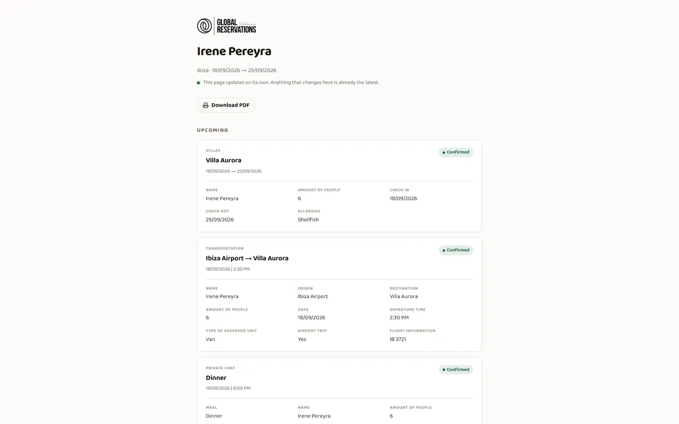
El cliente recibe un enlace, no un archivo. Un archivo nace viejo: cambia un horario y el cliente sigue mirando el papel anterior. El enlace se lee de la base cada vez, así que lo que abre es siempre lo que hoy es verdad. El proveedor tiene el suyo y ve únicamente sus propias reservas.
El valor de un viaje se calcula, no se escribe. Honorarios más comisión de las reservas que efectivamente ocurrieron. Un número escrito a mano no se suma, no se filtra y no se audita: en el sistema anterior, 335 de 597 comisiones eran una frase del tipo «agregar 20% al precio neto». Hoy las 597 son un número que se suma solo, y la comisión es parte del modelo y no una nota al margen.
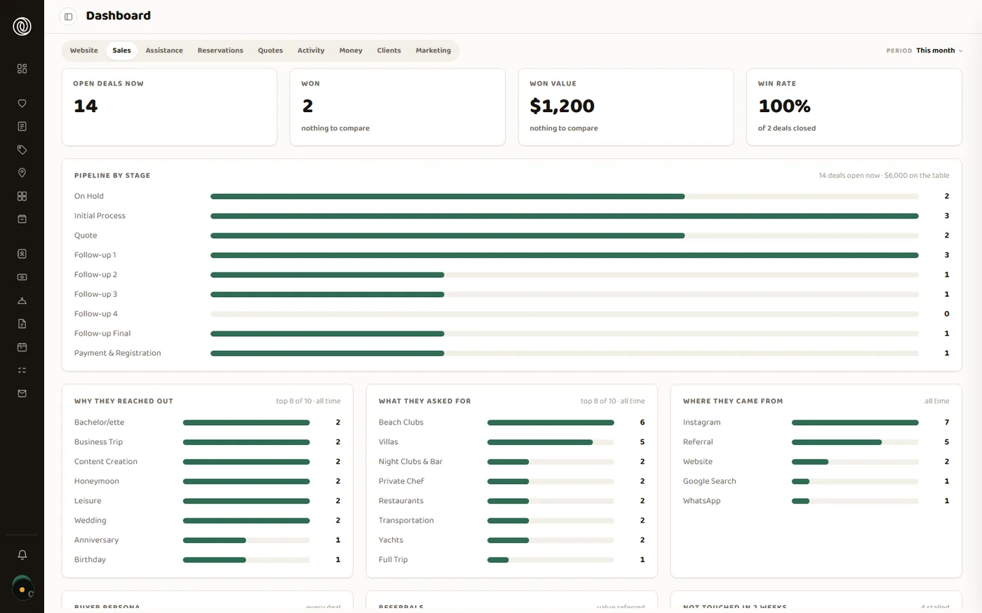
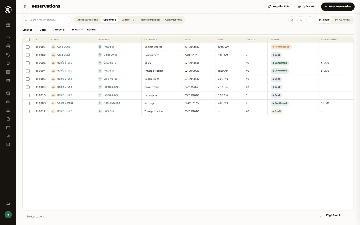
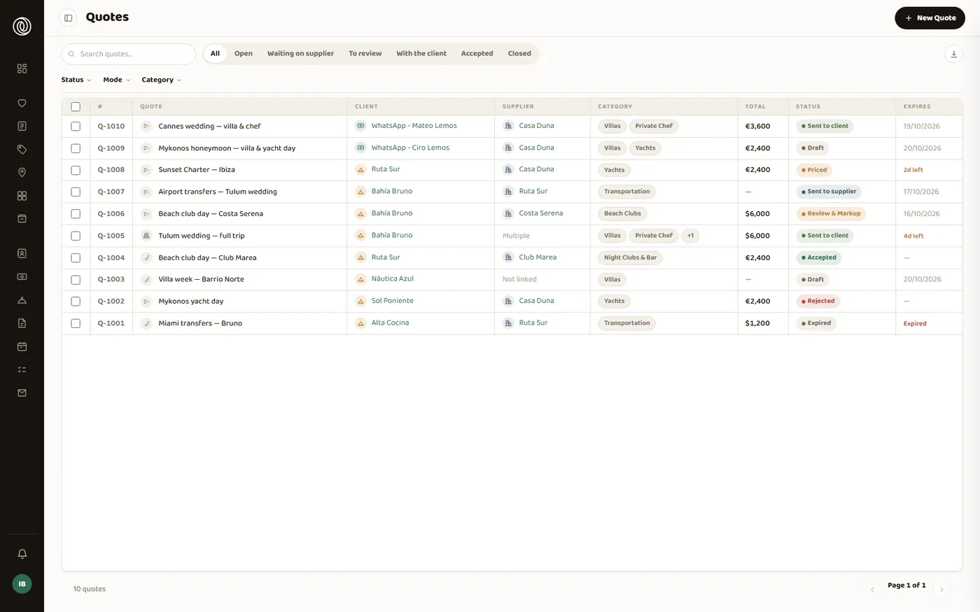
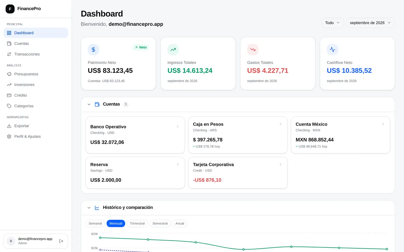
El sistema coordina hoy 2.572 contactos, 792 reservas y 1.067 viajes, con el mismo diseño y el mismo acceso que el sitio público de la agencia. Se abre una tarjeta y está el viaje entero con el estado de cada reserva. El cliente recibe un itinerario que se actualiza solo, el proveedor ve nada más que lo suyo, y las cotizaciones se arman por líneas con el total calculado.
Los campos por categoría de servicio, la comisión adentro del modelo y los documentos con reglas propias sobre qué muestran no existen en un sistema de mercado: el modelo es el de este negocio, y el mismo modelo aplica a cualquier operación que coordine proveedores en nombre de un cliente y cobre por eso.
A luxury travel agency was coordinating entire trips on a CRM built to sell, not to coordinate. And a trip is not a sale: it is a dozen bookings that all have to go right, in order — the airport transfer, the villa, the second-day chef, the yacht, Saturday's table — each with its own vendor, time and commission.
Nobody could see a whole trip at once. To know how a family's weekend was shaping up you had to open their contact, go into each booking and read the body of every message. We built the system where the trip is the centre and everything else hangs off it.
Inverting the model, even though it made the migration costlier. In the old system everything hung off the contact. Copying that shape made the data move direct and cheap; putting the trip at the centre made it far costlier, because every booking needed a trip to belong to and many of those trips did not exist as records: they had to be built from loose data. We chose the custom model. All 792 bookings ended up with their trip and their vendor, without a single exception.
What the client sees and what the agency keeps. The business depends on this call: if the itinerary shows the chef's or the driver's name, the client can skip the agency next time and the vendor relationship — the actual asset — is given away. But hide the restaurant's name and the client cannot get where they need to be. Solving it case by case does not scale across hundreds of bookings entered by different people. So we wrote a rule: the vendor is shown only when the client has to travel to them — a restaurant, a villa, a yacht — and never when the vendor comes to the client. There, the title is the service: the meal, the route, the vehicle.
A chef and a helicopter do not ask for the same data. A villa needs check-in and check-out; a transfer needs origin, destination and flight number; a chef needs menu and allergies. An off-the-shelf system forces a choice between one form that serves nobody and a free text box where everyone writes differently. We gave each category its own fields, and every service type carries the same colour throughout the system. The data stopped being a hand-typed sentence and became something you can filter, sort and total.
Moving eight years of operation without the business stopping for a day. The risk was not losing a record: it was switching the new system on halfway and working worse than before. We audited the whole account against its backup before writing a line, ran the full import dry — 5,171 rows — and turned nothing on until everything was in and verified. Along the way came fine repair: 105 trips arrived split across two records, 9 had the year mistyped — one showed travel through 2028 — and 2 departed before they arrived. All three were corrected before the system was switched on.
It should not look like a control panel. This is a system opened first thing and closed last thing. We ruled out the default look of every internal tool — system typeface, greys, borders — and used a paper ground, a single accent colour and the agency's own brand typeface throughout, tables included.
A table row never runs to two lines. Status goes in a colour or a pill. The easy way out when data does not fit is a second line, but with rows of different heights a list stops being scannable, and scanning lists is what people do all day here. The list scans top to bottom without stopping, which is what people do here all day.
The client gets a link, not a file. A file is born stale: change a time and the client is still looking at the old paper. The link reads from the database every time, so what they open is always what is true today. The vendor gets their own and sees nothing but their own bookings.
A trip's value is calculated, not typed. Fees plus commission from the bookings that actually happened. A hand-typed number cannot be totalled, filtered or audited: in the old system, 335 of 597 commissions were a sentence like "add 20% to the net price". Today all 597 are a number that totals itself, and commission is part of the model rather than a note in the margin.
The system now coordinates 2,572 contacts, 792 bookings and 1,067 trips, sharing its design and its login with the agency's public site. Open one card and the whole trip is there with the status of every booking. The client receives an itinerary that updates itself, the vendor sees only their own work, and quotes are built line by line with the total calculated.
Fields per service category, commission inside the model, and documents with their own rules about what they reveal do not exist in an off-the-shelf system: the model is this business's own, and the same model fits any operation that coordinates vendors on a client's behalf and charges for it.
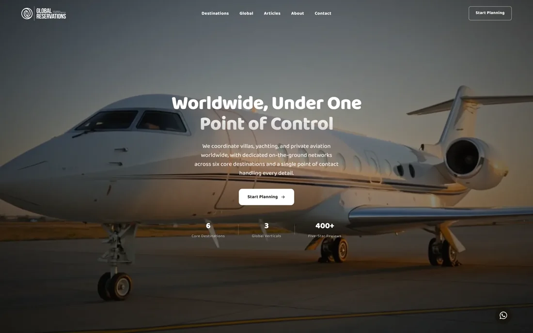
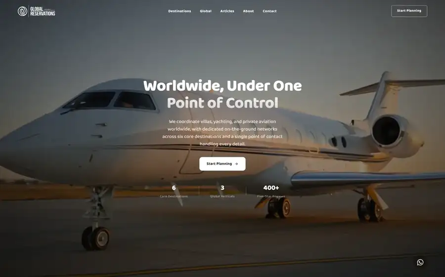
Una agencia que vende villas, yates y aviación privada tenía un sitio que se leía como un clasificado: tipografías pesadas de titular de diario, contenido que no se podía editar sin entrar al servidor y un catálogo de cientos de fichas que existía para quien ya tenía el enlace y para nadie más.
El problema de fondo no era estético. El sitio no acompañaba lo que la agencia cobra. Alguien que está por gastar en una villa en Ibiza compara, sin decirlo, contra las páginas de hoteles y marcas de lujo que ya conoce. Si la página se ve barata, la conversación empieza en desventaja y el precio parece alto aunque no lo sea.
Traducir la palabra lujo a decisiones concretas, sin caer en el vocabulario gastado del rubro. El lujo en pantalla tiene clichés —dorados, serifas de revista, fondos oscuros— y usarlos hace que la marca se parezca a todas las demás. Al mismo tiempo había que diferenciarse de la agencia común, que comunica volumen: grillas saturadas de ofertas, carteles de descuento, veinte filtros arriba de todo. Fijamos tres palabras antes de tocar una sola pantalla —calma, cuidado, criterio— y cada decisión posterior se validó contra ellas en vez de contra el gusto.
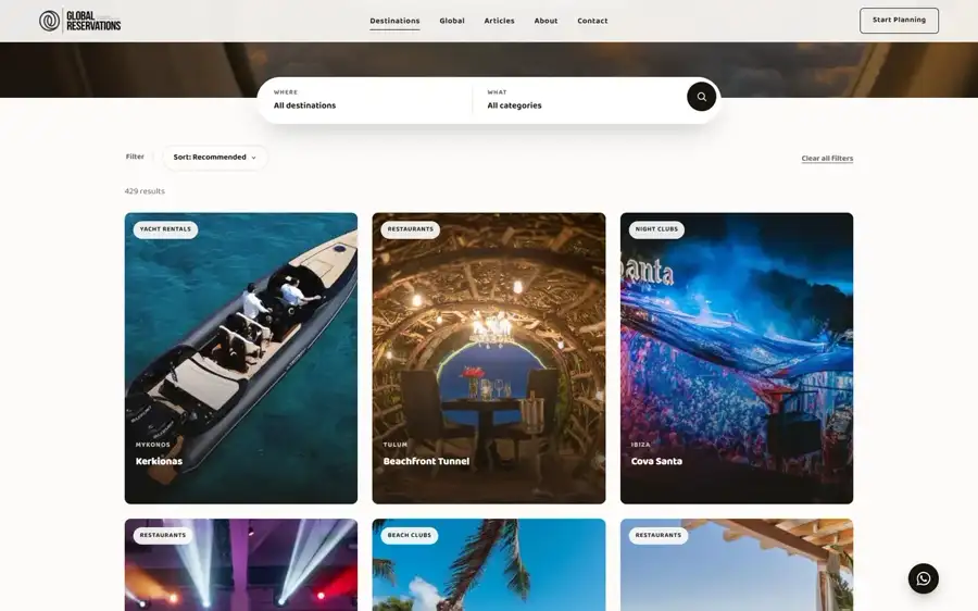
Un criterio de búsqueda que servía para varios tipos de producto, y una estructura que no lo permitía. El sitio anterior obligaba a que cada filtro perteneciera a una sola categoría. Pero «Zona» es exactamente el mismo criterio para restaurantes, beach clubs, villas y experiencias: duplicarlo cinco veces significa cinco listas que se desincronizan y un buscador que devuelve resultados distintos según por dónde entraste. Rediseñamos la relación para que un mismo criterio valga para varias categorías a la vez. Quien administra el catálogo define «Zona» una sola vez.
Los filtros del catálogo viejo no coincidían entre un lugar y otro. Eran 2.487 valores sobre 17 filtros y 180 opciones, y la equivalencia parecía derivable del nombre pero no lo era. Si asumíamos la regla obvia, los valores entraban bajo el criterio equivocado y nadie lo hubiera notado: las fichas se ven perfectas igual, y el error recién aparece cuando un cliente filtra por una zona y le salen lugares de otra. Armamos la equivalencia a mano, una por una, antes de cargar un solo valor.
Separar lo que tiene que encontrarse de lo que nunca debe aparecer. La agencia le manda a cada cliente su itinerario por un enlace privado. El reflejo es cerrarle la puerta al buscador, y ese reflejo hace lo contrario de lo que se busca: si se bloquea el acceso, el buscador no puede leer la instrucción de no publicar la página y la dirección puede aparecer igual. Lo hicimos al revés de lo intuitivo: esas páginas se dejan leer a propósito, para que la instrucción llegue y se cumpla. Y sobre ellas no se carga nunca ninguna herramienta de medición: el itinerario de un cliente no se mide.
Una sola familia tipográfica en todo el sitio, de trazo redondeado y terminaciones suaves, trabajada con sus pesos. Descartamos la mezcla habitual de dos familias y, sobre todo, el titular de diario que había antes. Un titular grueso grita, y una marca que vende villas y yates no grita. Cada familia extra es además peso que el visitante descarga antes de ver nada.
Paleta de papel, no de pantalla: blanco cálido de fondo, una tinta casi negra pero no negra para el texto, dos grises para lo secundario y un único acento, un verde jade profundo. Descartamos el dorado, que es el atajo del rubro y en pantalla ensucia más de lo que suma. Un solo acento obliga a que cada cosa marcada esté marcada por una razón: si todo se puede resaltar, nada resalta.
Menos fichas por pantalla y más espacio alrededor. En una página de catálogo la tentación es meter una fila más para que entre más producto arriba del pliegue. Hicimos lo contrario. El aire es lo que le dice al ojo que lo que está mirando fue elegido y no acumulado, y eso es exactamente lo que la agencia vende: selección, no volumen.
El sitio público y el panel de administración son una sola pieza, con un solo acceso y el mismo lenguaje visual. El camino corto era dejar el sitio como estaba y construir la administración aparte; quien carga el catálogo entra todos los días, y dos sistemas distintos significan dos lugares donde buscar y contenido que se desincroniza. Ese panel fue después la base sobre la que se construyó el CRM.
Migramos el catálogo entero: 563 experiencias con 3.612 fotos, sus secciones y sus filtros, verificando que no quedara ni una ficha apuntando a un lugar vacío. Las fotos vivían todavía en el servidor anterior, así que hicimos una segunda pasada para traerlas: hoy las 3.612 están del lado nuevo y el sitio viejo se puede apagar sin consecuencias.
El contenido lo edita la agencia desde su propio panel, sin tocar el servidor. Y el mapa que el sitio le entrega a los buscadores se arma solo desde el catálogo: cada destino, cada categoría, cada experiencia y cada artículo entra sin que nadie lo agregue a mano. Cuando se carga una experiencia nueva, aparece. Era el punto exacto donde el sitio anterior fallaba en silencio: las 563 fichas del catálogo pasaron a ser encontrables, y cada una que se sume después entra sola.
An agency selling villas, yachts and private aviation had a site that read like a classified ad: heavy newspaper-headline type, content that could not be edited without going into the server, and a catalogue of hundreds of listings that existed for whoever already had the link and for nobody else.
The underlying problem was not aesthetic. The site did not match what the agency charges. Someone about to spend on a villa in Ibiza compares, without saying so, against the hotel and luxury-brand pages they already know. If the page looks cheap, the conversation starts at a disadvantage and the price feels high even when it isn't.
Translating the word luxury into concrete decisions, without the category's worn-out vocabulary. Luxury on screen has its clichés — gold, magazine serifs, dark grounds — and using them makes a brand look like every other. At the same time it had to look unlike the ordinary agency, which communicates volume: grids crammed with offers, discount badges, twenty filters at the top. We fixed three words before touching a single screen — calm, care, judgment — and validated every later decision against them instead of against taste.
One search criterion served several product types, and the structure would not allow it. The old site forced every filter to belong to a single category. But "Zone" is exactly the same criterion for restaurants, beach clubs, villas and experiences: duplicating it five times means five lists that drift apart and a search that returns different results depending where you entered. We redesigned the relationship so one criterion can belong to several categories at once. Whoever runs the catalogue defines "Zone" once.
The old catalogue's filters did not match between one place and another. There were 2,487 values across 17 filters and 180 options, and the mapping looked derivable from the name but was not. Assuming the obvious rule would have loaded values under the wrong criterion, and nobody would have noticed: the listings look perfect either way, and the error only surfaces when a client filters by one zone and gets places from another. We built the mapping by hand, one by one, before loading a single value.
Separating what must be found from what must never appear. The agency sends each client their itinerary through a private link. The reflex is to shut the search engine out, and that reflex does the opposite of what you want: block access and the engine cannot read the instruction not to publish the page, so the address can show up anyway. We did the counter-intuitive thing: those pages are deliberately left readable, precisely so the instruction arrives and is obeyed. And no measurement tool ever loads on them: a client's itinerary is not measured.
One typeface family across the whole site, rounded strokes and soft terminals, worked through its weights. We ruled out the usual two-family pairing and, above all, the newspaper headline that came before. A thick headline shouts, and a brand selling villas and yachts does not shout. Every extra family is also weight the visitor downloads before seeing anything.
A paper palette, not a screen one: warm white ground, an almost-black-but-not-black ink for text, two greys for secondary matter and a single accent, a deep jade green. We ruled out gold, the industry shortcut, which on screen muddies more than it adds. One accent forces everything marked to be marked for a reason: if everything can be highlighted, nothing is.
Fewer listings per screen and more room around them. On a catalogue page the temptation is to fit one more row above the fold. We did the opposite. Air is what tells the eye that what it is looking at was selected, not accumulated — and that is exactly what the agency sells: selection, not volume.
The public site and the admin panel are one piece, with one login and the same visual language. The short path was to leave the site alone and build administration separately; whoever loads the catalogue is in it every day, and two systems mean two places to look and content that drifts apart. That panel later became the base the CRM was built on.
We migrated the whole catalogue: 563 experiences with 3,612 photos, their sections and their filters, verifying that not one listing pointed at an empty place. The photos still lived on the old server, so we made a second pass to bring them across: all 3,612 now sit on the new side and the old site can be switched off with no consequence.
The agency edits its content from its own panel, without touching the server. And the map the site hands to search engines builds itself from the catalogue: every destination, category, experience and article enters without anyone adding it by hand. Load a new experience and it appears. That was the exact point where the old site failed silently: all 563 catalogue listings became findable, and every one added later enters on its own.
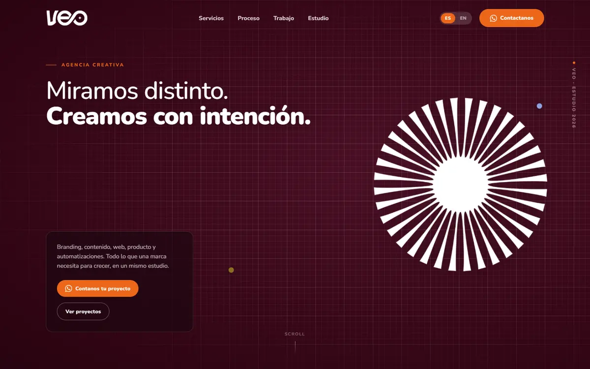
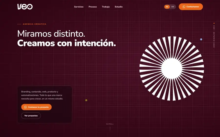
VEO Creativo es una agencia creativa de Tucumán: ocho servicios —marca, estrategia, comunicación, audiovisual, publicidad, diseño, web y automatizaciones— para empresas medianas de rubros que no se parecen entre sí.
El sitio de una agencia creativa tiene un problema que otros no tienen: es su propio portfolio. Si no se ve bien, ya contestó la pregunta que el visitante venía a hacer. Y hay que resolverlo antes de que el visitante lea una sola palabra.
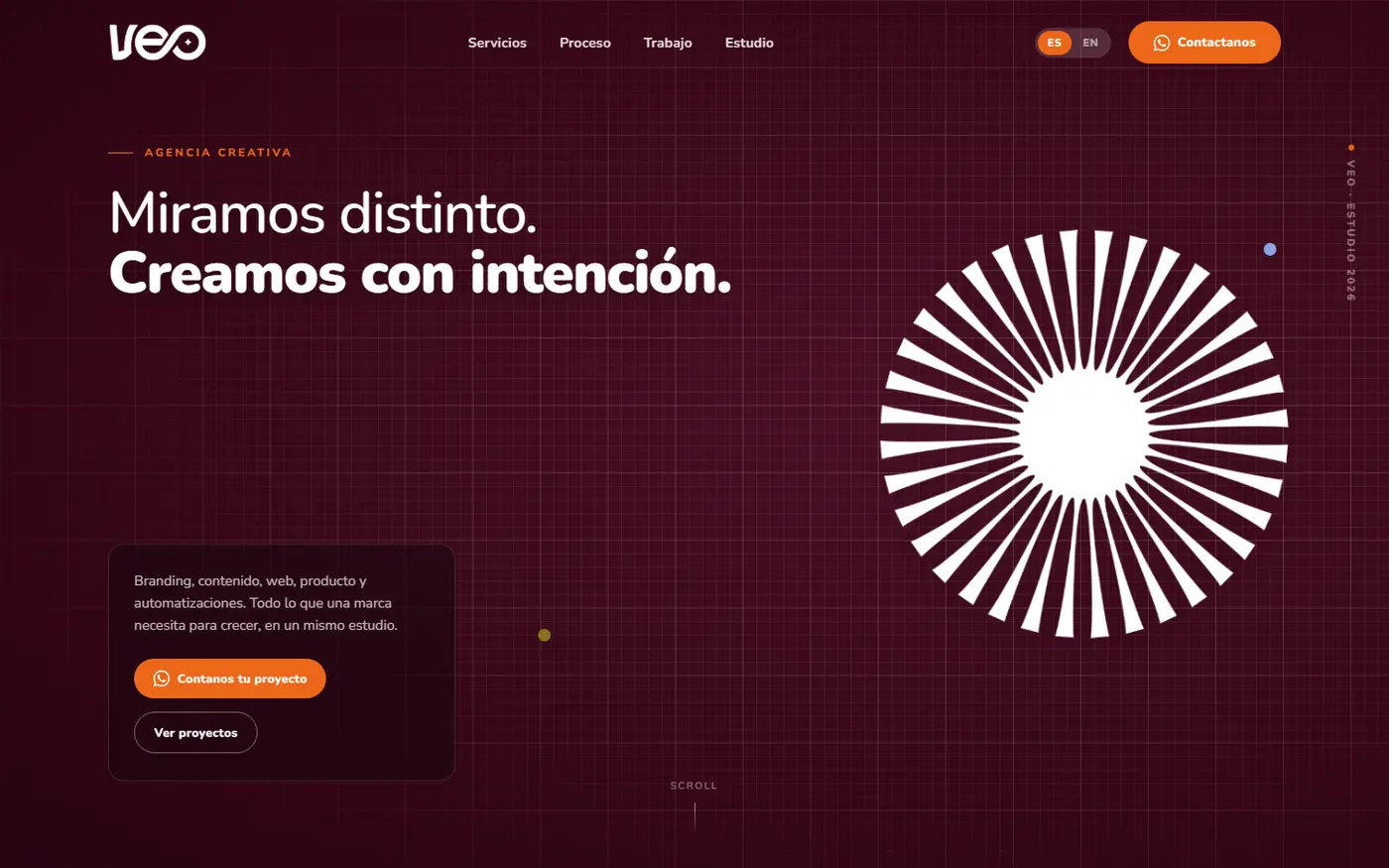
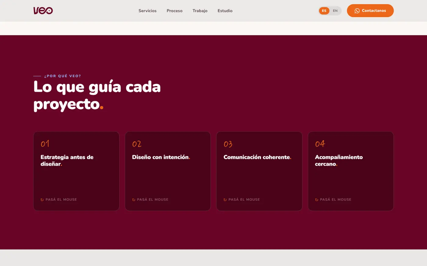
Demostrar criterio de diseño sin las fotos de los proyectos. La forma habitual de ganarse la confianza en este rubro es el material fotográfico del trabajo hecho, y ese material todavía no estaba. Pusimos a cargar la credibilidad en lo que sí controlábamos: una escala tipográfica muy grande sostenida por una tipografía redonda de trazo grueso, la paleta de la propia marca aplicada en bloques de color pleno, mucho aire y una única secuencia de movimiento en la apertura. El sitio demuestra criterio en vez de anunciarlo: la composición se sostiene sola, y las fotos entran en su lugar sin que haya que rehacer nada.
La dueña pidió que fuera plano, y aun así tenía que quedar memorable. Su frase fue «si es plano, mejor». Un sitio de agencia suele apoyarse en efectos para llamar la atención; al sacarlos, todo el peso queda en composición, escala y color, que es exactamente lo que se ve pobre más rápido si está mal resuelto. Quedaron afuera cinco recursos —tachar el texto al bajar, iluminar las palabras como un karaoke, inclinar las imágenes en tres dimensiones, numerar los servicios, rodear la pieza de marca con un halo— y concentramos todo el movimiento en una sola secuencia de apertura. El impacto lo dan la escala de los títulos y una sección entera de color pleno.
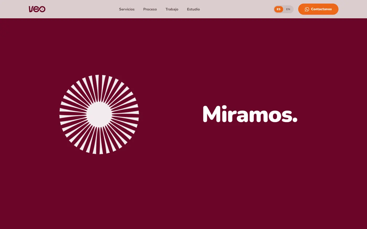
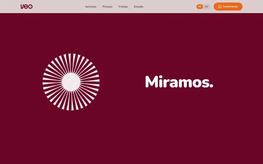
Una apertura que tiene que aterrizar exactamente sobre el logo, en cualquier pantalla. No es una animación que termina en cualquier lado: una pieza de la marca gira mientras aparecen cuatro palabras, una por vez, y al final tiene que caer justo encima del logo del encabezado. Un desvío mínimo arruina el efecto y se nota más que si no hubiera animación. En el teléfono el objetivo además se mueve, porque la barra del navegador se esconde al bajar y corre el punto de llegada mientras la secuencia corre. El punto de aterrizaje se recalcula cada vez que la pantalla cambia de alto, que es justo cuando se corre.
Dos idiomas que no venden igual. Traducir el texto es la parte fácil. El canal de contacto es donde el sitio convierte, y el que se usa acá no es el que usa un cliente en Estados Unidos: dejar el mismo botón en las dos versiones significa que a la mitad de los visitantes no les queda una forma natural de escribir. El cambio de idioma cambia el canal, no sólo las palabras: en español los botones abren un chat directo, en inglés abren un formulario.
Dos tipografías con roles opuestos. Una redonda de trazo grueso sostiene títulos muy grandes sin volverse dura y carga casi todo el peso. La otra es manuscrita y aparece poquísimo: números, un pie de línea, el nombre de un proyecto sobre la foto. Descartamos usarla también en los títulos: una agencia que escribe todo a mano se lee como emprendimiento chico. Reservada para apariciones mínimas, aporta calidez sin costar autoridad.
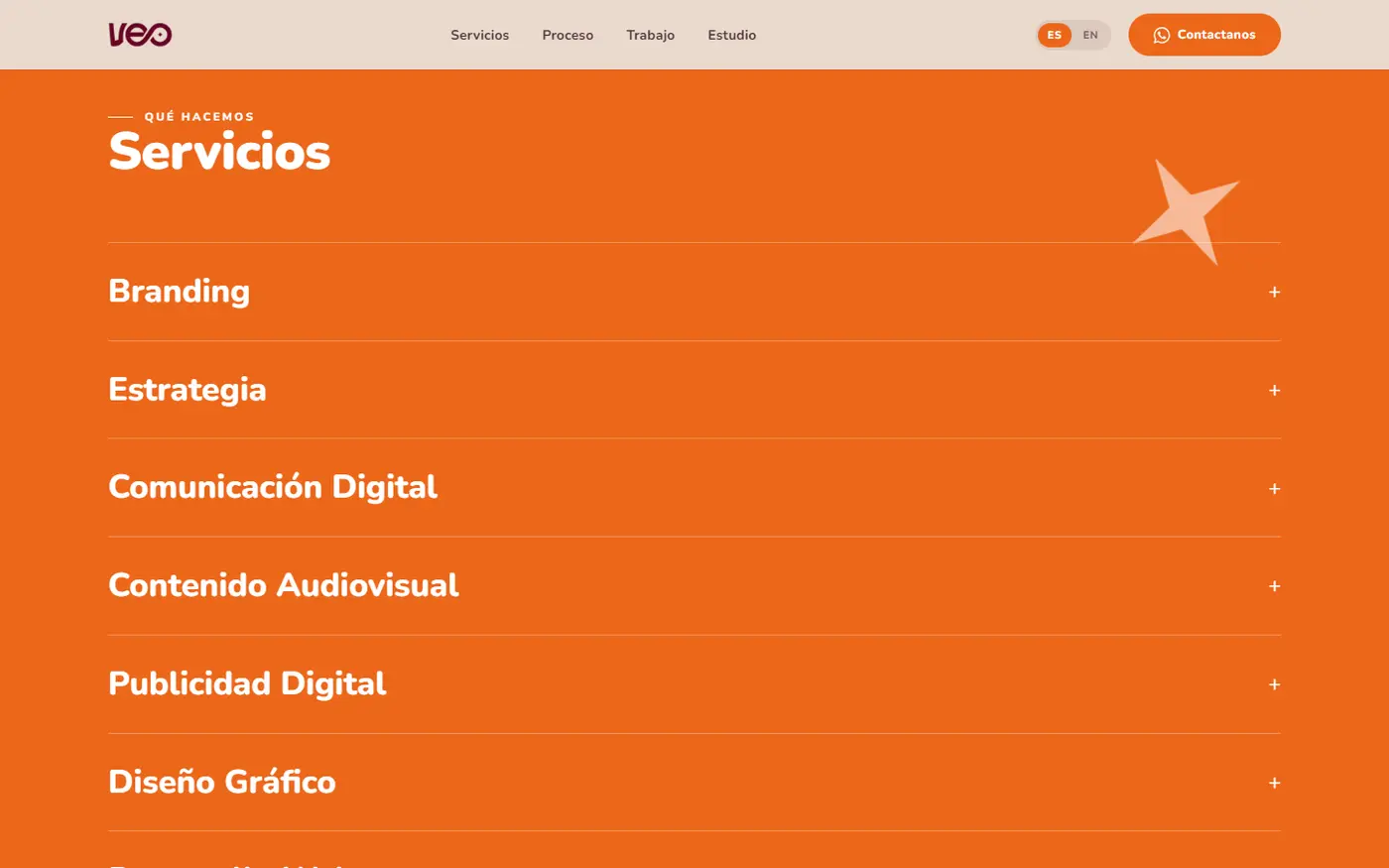
El contraste de temperatura, sostenido sin transición. Secciones enteras en bordó profundo y después una sección entera en naranja pleno, de golpe. Un salto tan duro corre el riesgo de leerse como que algo se rompió, y el recurso obvio para suavizarlo —un degradado— sobre el naranja se veía como una mancha. Sostuvimos el corte seco y le dimos al naranja un único trabajo en todo el sitio: todo lo que se toca. Así el cambio de color se lee como cambio de sección y no como accidente. Los tres colores de apoyo aparecen dosificados para que el naranja siga siendo el único acento fuerte.
El contenido no pasa de 1.216 píxeles de ancho aunque la pantalla mida el doble, y los títulos entran solos antes que su texto. El aire es lo que hace que un sitio de agencia se lea como caro, y hacer entrar el título primero fija la jerarquía antes de que empiece la lectura.
La grilla de proyectos se reacomoda sola, de a dos bloques cada pocos segundos, como si se estuviera ordenando. Los trabajos vienen de construcción, tecnología, automotor, mobiliario, inmobiliario y viajes: puestos uno al lado del otro, ese surtido se puede leer como falta de foco en vez de versatilidad. El movimiento hace que la variedad se lea como orden emergente. En el teléfono se apaga, porque con menos campo visual el mismo recurso molesta.
Ocho servicios que se abren de a uno —el visitante ve primero el mapa completo y el detalle sólo del que le interesa—, nueve proyectos con su categoría y lo que se hizo en cada uno, y una ficha de la fundadora. Todo en dos idiomas, con el canal de contacto correcto en cada uno.
La grilla se verificó sin huecos en siete anchos de pantalla, de 1.920 a 390 píxeles. Cada avance se aprobó en el celular de la dueña, con un enlace que abría sin instalar nada, así que la escala tipográfica, el aire y el movimiento se validaron primero en la pantalla donde el sitio se ve de verdad. Cuatro rondas de correcciones, todas cerradas.
VEO Creativo is a creative agency in Tucumán: eight services — brand, strategy, communications, film, advertising, design, web and automation — for mid-sized companies in fields with nothing in common.
A creative agency's website has a problem others do not: it is its own portfolio. If it does not look good, it has already answered the question the visitor came to ask. And it has to answer it before they read a single word.
Proving design judgment without the project photography. The usual way to earn trust in this category is the photographic record of work done, and that material was not ready. We loaded the credibility onto what we did control: a very large type scale held by a rounded, thick-stroked face, the brand's own palette applied in blocks of solid colour, a lot of air, and a single motion sequence at the opening. The site demonstrates judgment instead of announcing it: the composition stands on its own, and the photos drop into place without anything being redone.
The owner asked for flat, and it still had to be memorable. Her words were "if it's flat, better". An agency site usually leans on effects to get attention; strip them and all the weight falls on composition, scale and colour, which is exactly what looks cheap fastest when it is badly resolved. Five devices were ruled out — striking through text on scroll, lighting words up like karaoke, tilting images in three dimensions, numbering the services, ringing the brand mark with a halo — and we concentrated all the motion into one opening sequence. The impact comes from the scale of the headings and one section in solid colour.
An opening that has to land exactly on the logo, on any screen. This is not an animation that ends anywhere: a piece of the brand mark spins while four words appear one at a time, and at the end it must fall precisely onto the header logo. A small drift ruins the effect and reads worse than no animation at all. On phones the target moves too, because the browser bar hides on scroll and shifts the landing point mid-sequence. The landing point is recalculated every time the screen changes height, which is exactly when it shifts.
Two languages that do not sell the same way. Translating the text is the easy part. The contact channel is where the site converts, and the one used here is not the one a client in the United States uses: leaving the same button in both versions means half the visitors have no natural way to write. The language switch changes the channel, not just the words: in Spanish the buttons open a direct chat, in English they open a form.
Two typefaces with opposite jobs. A rounded, thick-stroked one holds very large headings without turning harsh and carries almost all the weight. The other is handwritten and appears rarely: numbers, a caption, a project name over a photo. We ruled out using it for headings too: an agency that writes everything by hand reads like a small side project. Kept to minimal appearances, it adds warmth without costing authority.
The temperature contrast, held with no transition. Whole sections in deep burgundy and then a whole section in solid orange, all at once. A cut that hard risks reading as something broken, and the obvious fix — a gradient — looked like a smudge over the orange. We held the hard cut and gave the orange a single job across the site: everything you touch. That way the colour change reads as a change of section, not an accident. The three supporting colours appear sparingly so the orange stays the only strong accent.
Content never exceeds 1,216 pixels wide even when the screen is twice that, and headings arrive on their own before their text. Air is what makes an agency site read as expensive, and letting the heading land first sets the hierarchy before reading begins.
The project grid rearranges itself, two blocks at a time every few seconds, as if it were sorting itself out. The work comes from construction, technology, automotive, furniture, real estate and travel: side by side, that spread can read as a lack of focus rather than range. The motion makes the variety read as emerging order. On phones it switches off, because with less field of view the same device gets in the way.
Eight services that open one at a time — the visitor sees the full map first and the detail only of what interests them — nine projects with their category and what was done on each, and a profile of the founder. All in two languages, with the right contact channel in each.
The grid was verified with no gaps across seven screen widths, from 1,920 down to 390 pixels. Every stage was approved on the owner's own phone, through a link that opened with nothing to install, so the type scale, the air and the motion were validated first on the screen where the site is actually seen. Four rounds of corrections, all closed.
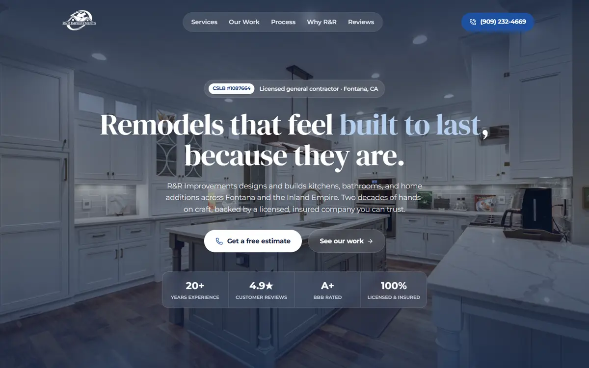
R&R Improvements es una empresa familiar de remodelación en Fontana, California: cocinas, baños, ampliaciones, unidades habitacionales y conversiones de garage. Veinte años de oficio, y todo el negocio pasa por una visita a la casa y un presupuesto escrito a mano.
La prueba de esos veinte años existía, pero estaba repartida en lugares que no se sumaban entre sí. Necesitaban un lugar donde la empresa se viera entera y donde alguien decidiera confiar en un minuto, desde el celular.
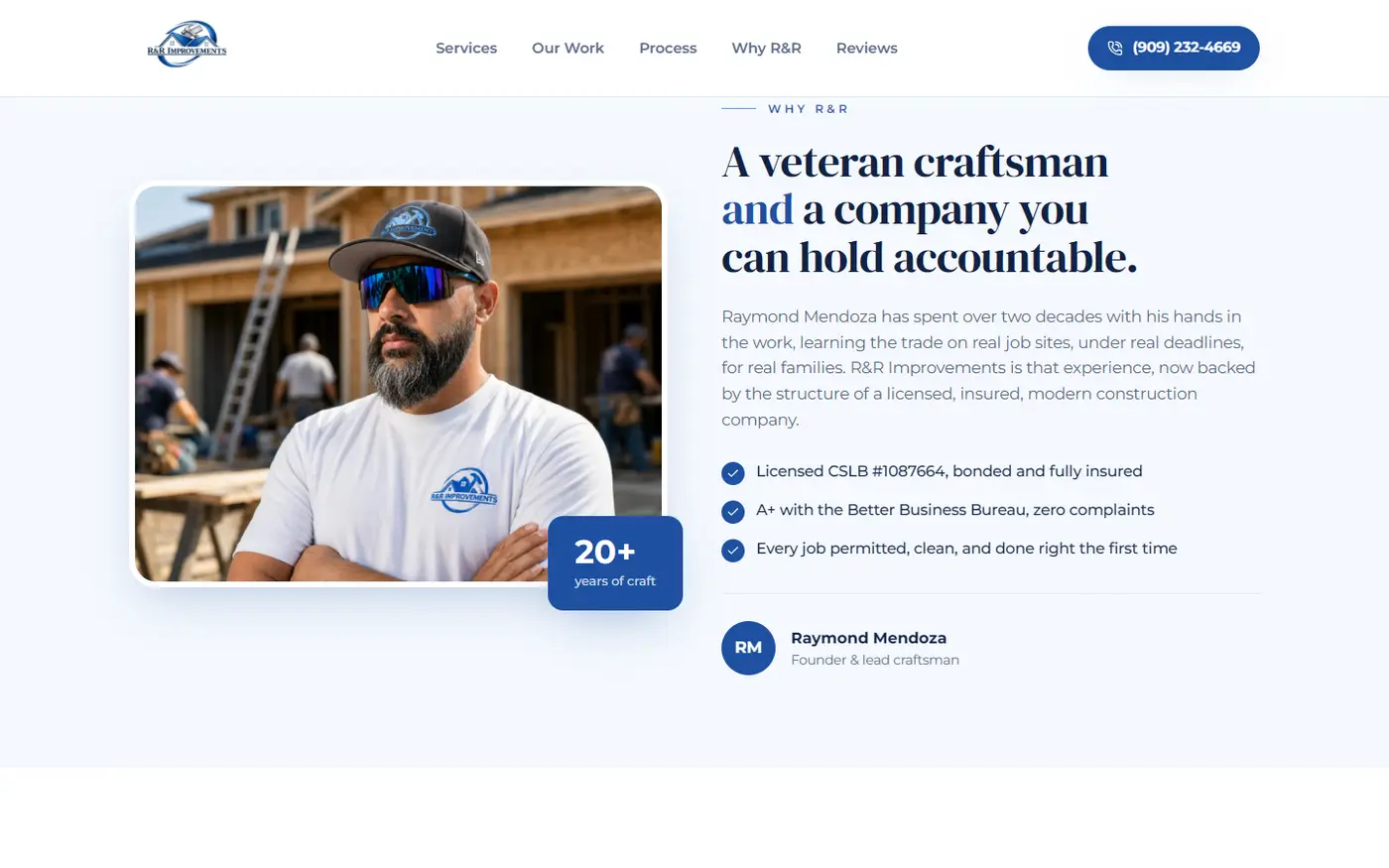
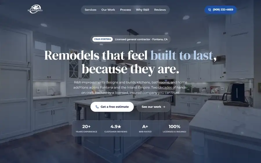
Dar confianza para un trabajo caro e invasivo, teniendo siete reseñas contra competidores con 78, 110, 137 y 416. El cliente final va a dejar entrar desconocidos a su casa durante semanas y a pagar mucho dinero. El volumen de reseñas es la moneda habitual de confianza en este rubro y no se consigue en el corto plazo. Así que auditamos a la competencia local buscando dónde eran todos débiles, y aparecieron dos huecos: veinte empresas repitiendo «affordable» y «quality» sin mostrar una sola obra propia, y casi ninguna publicando su número de licencia. Cambiamos la moneda de la prueba: donde no se podía ganar por cantidad, se ganó siendo el único que muestra papeles y obra real.
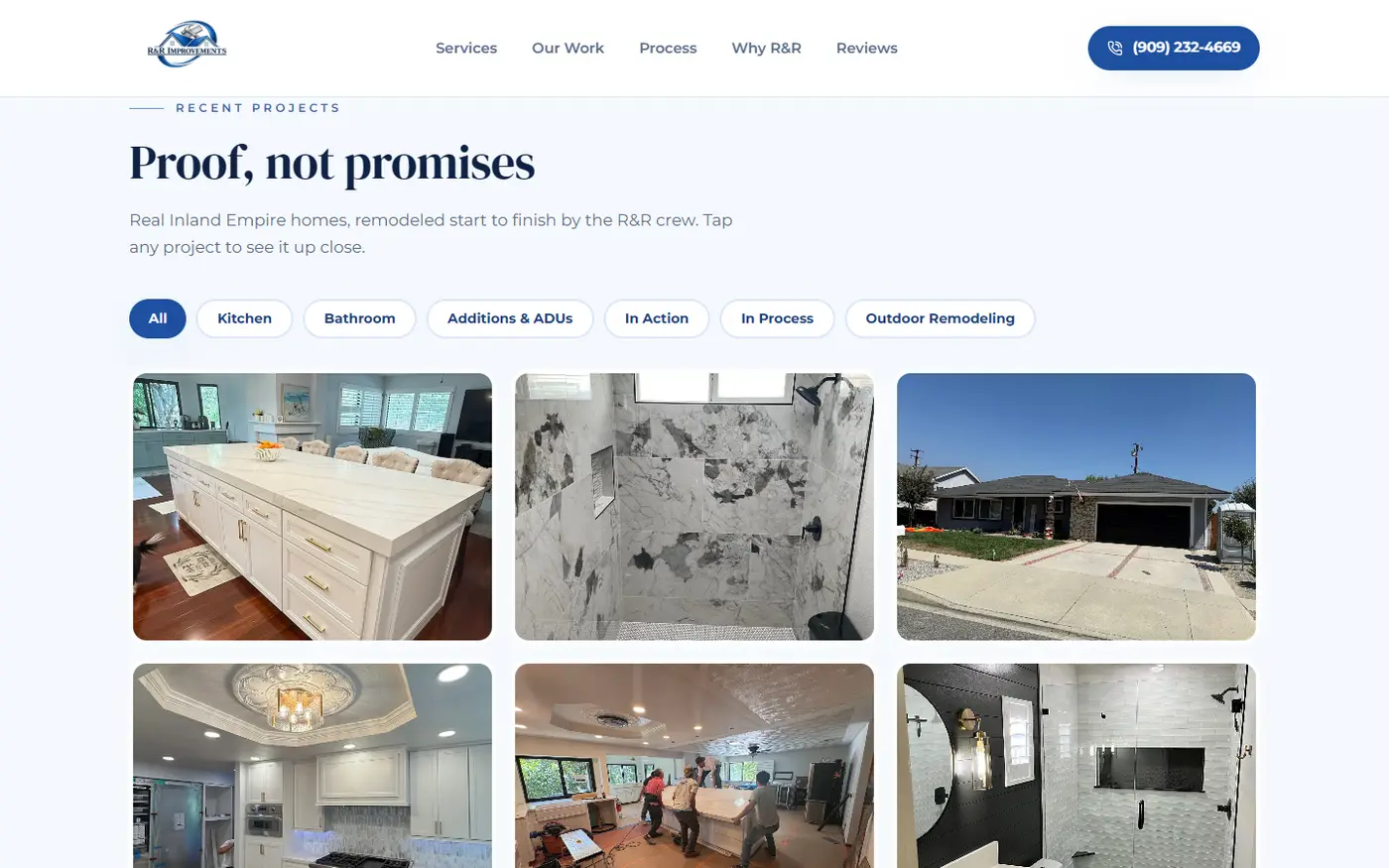
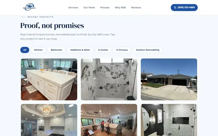
La galería tenía que probar, no decorar. En una sección que se llama «Proof, not promises», una sola imagen que no sea del cliente invalida todo lo demás. El archivo tenía duplicados casi idénticos, títulos que no correspondían a la foto y material heredado de otras fuentes. La comparación automática por parecido no distingue una cocina de una ampliación, así que la revisión fue visual: hojas de contacto con todo el archivo agrupado por categoría, miradas de a tandas. Aparecieron tres duplicadas que ninguna herramienta había marcado, y quedó la regla dura: sólo obra propia, con el material dudoso apartado para que lo confirme el dueño antes de usarlo.
Meter 55 proyectos en una página que no puede tardar en cargar ni abrumar a quien la abre desde el teléfono. La prueba visual pide cantidad y la experiencia pide brevedad: dos exigencias opuestas sobre la misma página, y la mayoría de estas visitas llega con datos móviles. La galería abre con seis y suma de a seis cuando la persona lo pide, con filtros por tipo de trabajo para que quien vino a ver un baño no recorra ampliaciones. El peso total de las fotos bajó de 50,2 MB a 5,4 MB, ninguna por encima de 250 KB, dejando intactas las que ya cumplían en vez de pasarlas por el mismo molde.
Diseñar para un dueño que no atiende herramientas digitales, y que el sitio igual convierta. La expectativa de un sitio moderno empuja hacia reserva de turnos, formularios y chat. Pero un canal abierto que nadie atiende es peor que no tenerlo, porque pierde justo a la persona que ya se había decidido a avanzar. Descartamos la reserva online y concentramos todo en el teléfono, que es el único canal que él realmente atiende. El sitio, los servicios, las preguntas frecuentes y el contacto apuntan todos al mismo número.
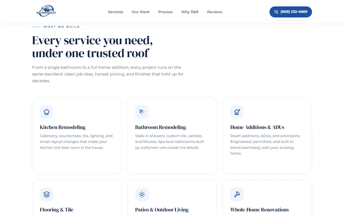
Una serif de peso para los títulos y una sans neutra para el cuerpo. Lo cómodo —y lo que hace la competencia— era una sola sans para todo, y con eso el sitio quedaba con aire de plantilla, que es exactamente lo contrario de lo que hay que transmitir cuando el argumento de venta son veinte años de oficio. La serif le pone edad y peso a los títulos; la sans mantiene el cuerpo legible en pantallas chicas, que es donde se lee de verdad.
Una escala de azules construida sobre el azul del logo, con un azul muy oscuro para el texto en lugar de negro puro. El negro sobre blanco endurece la lectura y no pertenece a la marca; el azul profundo conserva el contraste que hace falta y hace que hasta el texto corrido forme parte del mundo de color de la empresa.
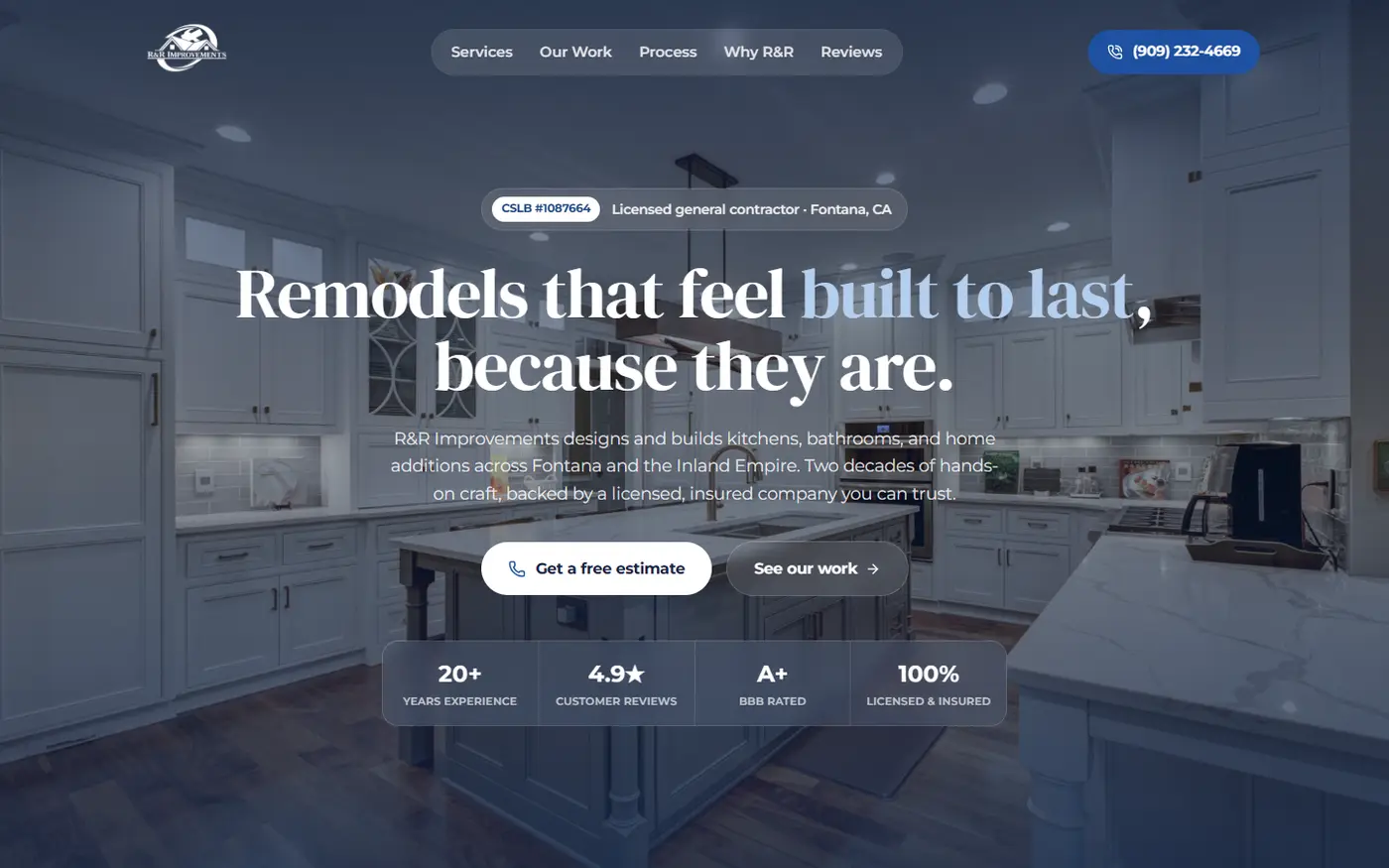
El número de licencia arriba, a la vista, y repetido en cada punto de decisión. Casi toda la competencia local lo deja en la letra chica del pie. Es el dato más barato de mostrar y el que más tranquiliza a alguien que está por dejar entrar gente a su casa durante semanas.
Las primeras seis fotos son la promesa entera del sitio. El orden en el que llegan las fotos nunca es el orden en que hay que mostrarlas. La galería abre con las seis más fuertes y variadas —isla de mármol, ducha de mármol, frente terminado, cocina con equipamiento profesional, el equipo colocando la mesada, un baño moderno— y después rota entre categorías para mostrar el rango. La obra en curso demuestra actividad, pero quien está por gastar mucho dinero quiere ver el final, no el medio.
Un servicio no recibe vidriera hasta que exista una foto que le haga justicia. La alternativa era completar la grilla con lo que hubiera a mano —estructura de madera, un pasillo modesto—, y una vidriera construida sobre obra en curso baja el nivel percibido de todo lo que la rodea. Quedó escrita la lista exacta de tomas que pide cada sección para la próxima sesión de fotos.
El sitio es hoy el único lugar donde la empresa se ve entera. La portada abre con el número de licencia y el respaldo a la vista, los nueve servicios están descritos con las palabras con las que la gente busca, y la galería muestra 55 proyectos propios en seis categorías con filtros y carga progresiva. Un comparador de antes y después se arrastra con el dedo: convierte la prueba en algo que el visitante opera con su propia mano en vez de algo que le cuentan.
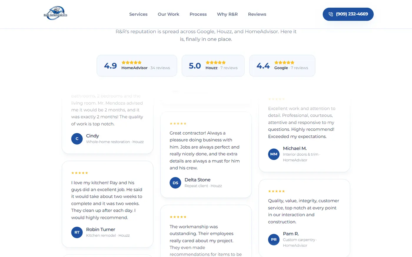
Y las calificaciones que afuera están repartidas aparecen reunidas en una sola franja: 48 reseñas de tres plataformas, con sus puntajes a la vista, en el mismo lugar. La reputación dejó de depender de a qué puerta golpeó la persona. El dueño manda el enlace a cualquiera que lo llame y esa persona ve, en un minuto y desde el celular, veinte años de obra terminada, la prueba de que la empresa es legal y un solo número al que llamar. La galería está construida para crecer: cada tanda de fotos nuevas entra en su categoría sin rediseñar nada.
R&R Improvements is a family remodeling company in Fontana, California: kitchens, bathrooms, additions, accessory dwelling units and garage conversions. Twenty years of craft, and the whole business runs through a visit to the house and a hand-written estimate.
The proof of those twenty years existed, but it was scattered across places that never added up. They needed one place where the company could be seen whole and where someone decides to trust in a minute, from their phone.
Building trust for expensive, invasive work with seven reviews against competitors holding 78, 110, 137 and 416. The client is about to let strangers into their home for weeks and pay a lot of money. Review volume is the usual currency of trust in this trade and it cannot be acquired quickly. So we audited local competitors looking for where they were all weak, and two gaps appeared: twenty companies repeating "affordable" and "quality" without showing a single project of their own, and almost none publishing their license number. We changed the currency of proof: where we could not win on quantity, we won by being the only one showing papers and real work.
The gallery had to prove, not decorate. In a section called "Proof, not promises", a single image that is not the client's invalidates everything else. The archive had near-identical duplicates, titles that did not match the photo, and inherited material from other sources. Automatic similarity comparison cannot tell a kitchen from an addition, so the review was visual: contact sheets with the whole archive grouped by category, gone through in batches. Three duplicates surfaced that no tool had flagged, and the hard rule stood: only their own work, with anything doubtful set aside for the owner to confirm before use.
Fitting 55 projects into a page that can neither be slow nor overwhelm someone opening it on a phone. Visual proof wants quantity and the experience wants brevity: two opposing demands on the same page, and most of these visits arrive on mobile data. The gallery opens with six and adds six more when the person asks, with filters by type of job so whoever came to see a bathroom does not scroll through additions. Total photo weight dropped from 50.2 MB to 5.4 MB, none above 250 KB, leaving untouched the ones that already qualified rather than running them through the same mould.
Designing for an owner who does not work through digital tools, and still converting. The expectation of a modern site pushes toward online booking, forms and chat. But an open channel nobody answers is worse than no channel, because it loses exactly the person who had already decided to move forward. We ruled out online booking and concentrated everything on the phone, the one channel he actually answers. The site, the services, the FAQ and the contact all point to the same number.
A weighted serif for headings and a neutral sans for body text. The comfortable option — and what the competition does — was a single sans throughout, and that left the site reading like a template, which is the opposite of what you need when the sales argument is twenty years of craft. The serif gives the headings age and weight; the sans keeps body text readable on small screens, which is where it is actually read.
A scale of blues built on the logo's own blue, with a very dark blue for text instead of pure black. Black on white hardens reading and does not belong to the brand; the deep blue keeps the contrast you need and makes even body copy part of the company's colour world.
The license number up top, in plain sight, repeated at every decision point. Almost every local competitor leaves it in the footer's fine print. It is the cheapest thing to show and the most reassuring to someone about to let people into their home for weeks.
The first six photos are the site's entire promise. The order photos arrive in is never the order to show them in. The gallery opens with the six strongest and most varied — marble island, marble shower, finished exterior, kitchen with professional equipment, the crew setting the countertop, a modern bathroom — then rotates between categories to show the range. Work in progress demonstrates activity, but someone about to spend serious money wants to see the end, not the middle.
A service gets no showcase until a photo exists that does it justice. The alternative was filling the grid with whatever was at hand — timber framing, a modest hallway — and a showcase built on work in progress lowers the perceived level of everything around it. The exact list of shots each section needs was written up for the next photo session.
The site is now the only place where the company can be seen whole. The homepage opens with the license number and the credentials in plain sight, the nine services are described in the words people actually search with, and the gallery shows 55 of their own projects across six categories with filters and progressive loading. A before-and-after comparator drags under your finger: it turns the proof into something the visitor operates with their own hand rather than something they are told.
And the ratings scattered out there appear gathered into a single band: 48 reviews across three platforms, scores in plain sight, all in one place. Reputation stopped depending on which door the person happened to knock on. The owner sends the link to anyone who calls, and that person sees, in a minute and from their phone, twenty years of finished work, proof that the company is legitimate, and one number to call. The gallery is built to grow: each new batch of photos enters its category without redesigning anything.
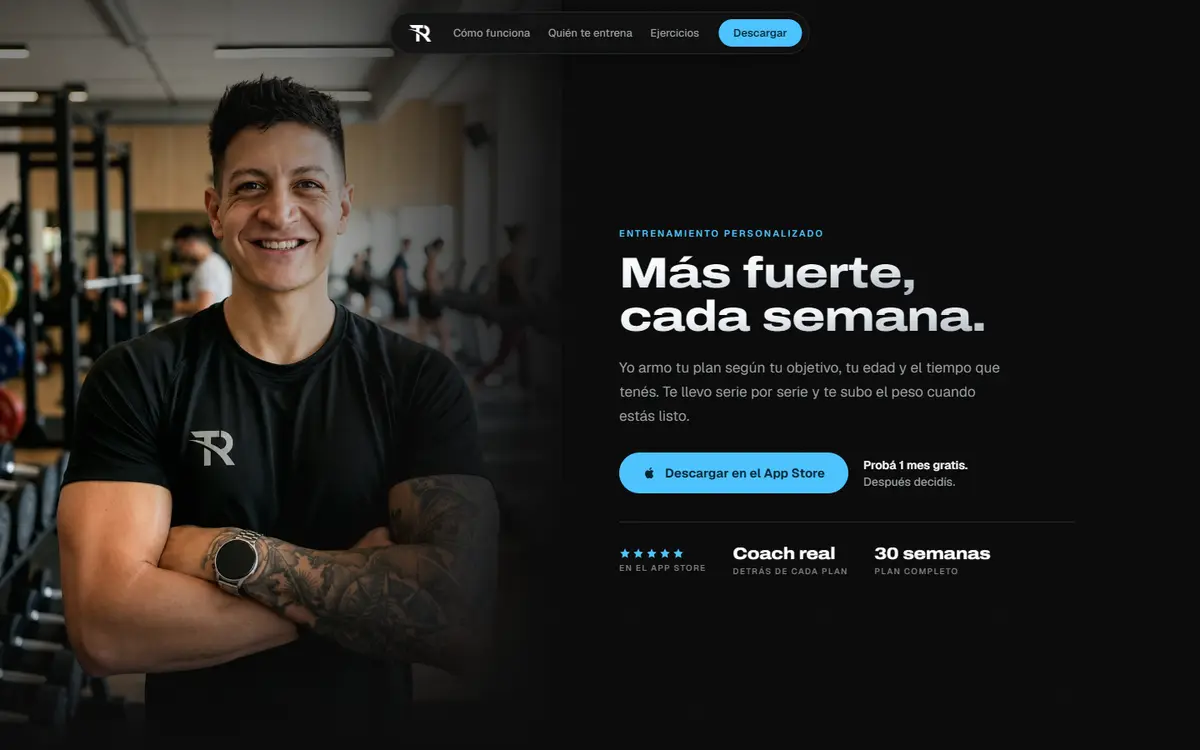
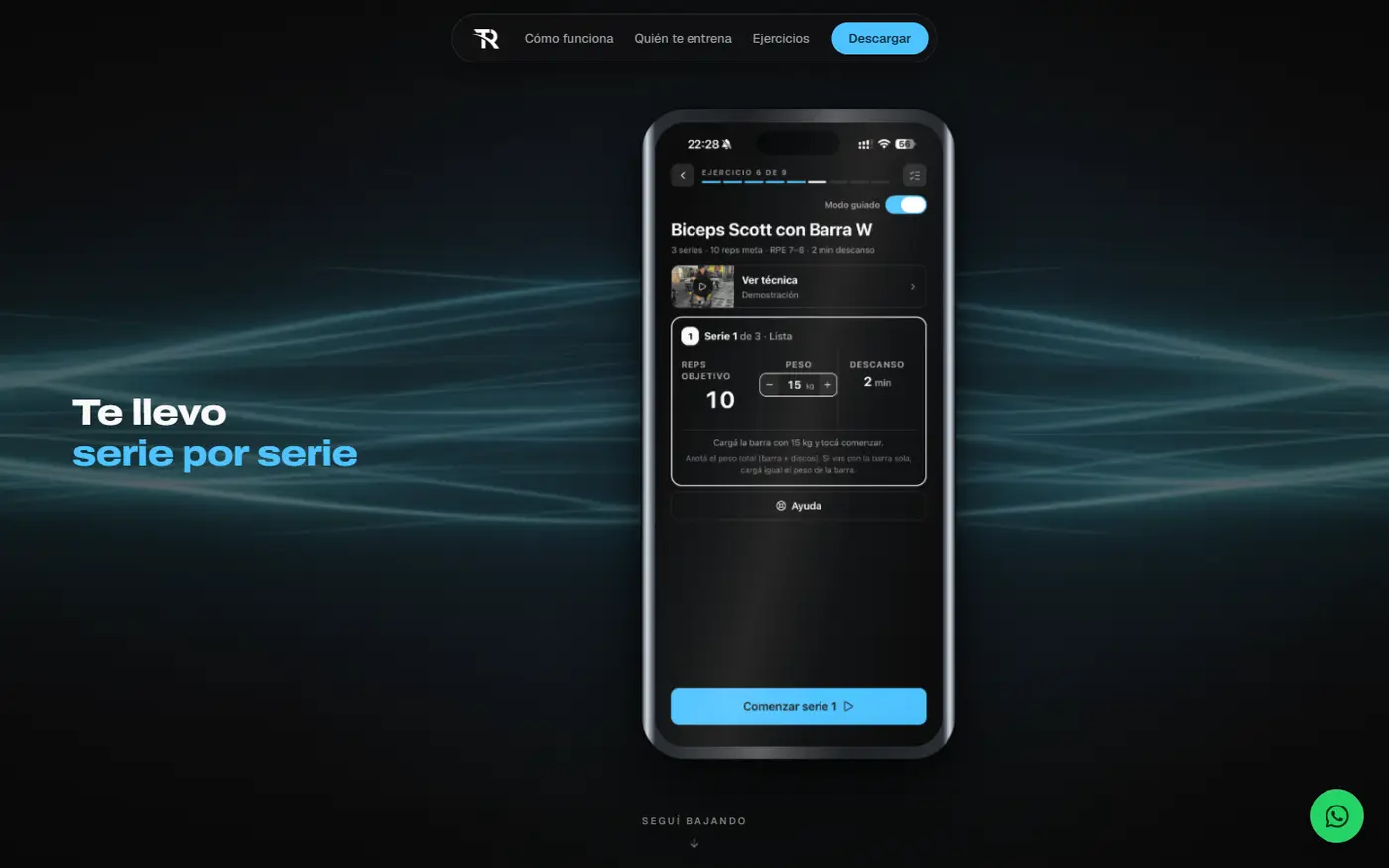
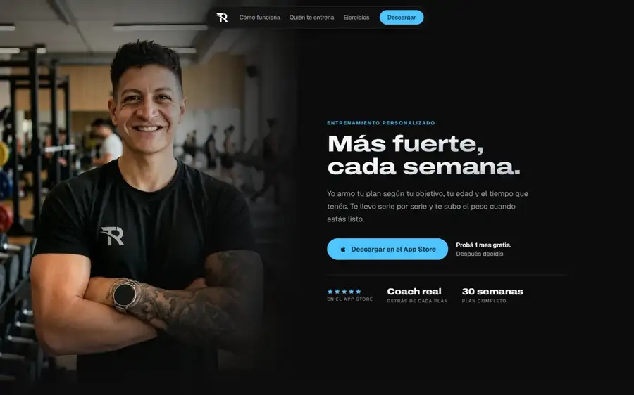
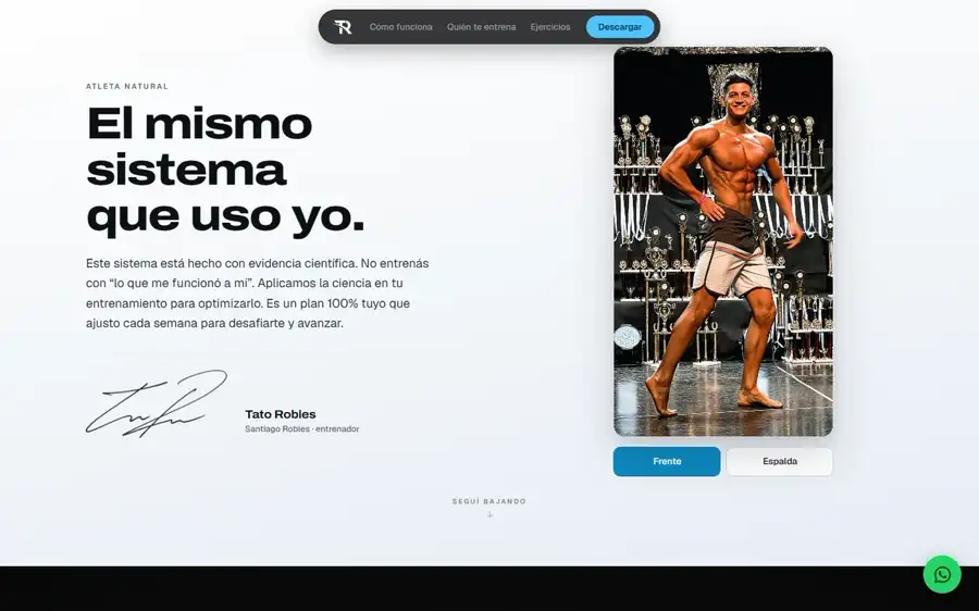
TR Fit es una app de entrenamiento de fuerza con coach real: el usuario recibe un plan armado a mano y, al terminar cada serie, declara cuánto esfuerzo le costó. Eso cambia el peso de la serie siguiente. El sitio existe para conseguir descargas, no para vender el servicio de coaching que vendía el sitio anterior.
El diferencial del producto no es una pantalla: es una decisión que el usuario toma después de cada serie. Un video muestra una pantalla, no muestra una decisión. Y era justamente eso lo que había que hacer entender en tres segundos.
No había con qué mostrar el producto que el sitio venía a vender. De los veintiocho archivos entregados, quince eran únicos y cinco servían: cuatro capturas de la app y el logo. Los seis videos de presentación mostraban interfaces que no son las de la app y palabras deformadas donde tenía que decir Constancia o Historial: ninguno era publicable ni recuperable con edición. En vez de filmar la app o volver a generarla, reconstruimos su interfaz dentro del propio sitio, pantalla por pantalla, usando las cuatro capturas reales como plano exacto. Lo que el visitante ve es la app de verdad, con su texto real, nítida en cualquier tamaño de pantalla y sin una versión aparte para celular. Costo de producción del material: cero.
Convertir la decisión del usuario en algo que se entienda sin leer. Hicimos de esa secuencia la sección firma del sitio y la atamos al scroll en cuatro etapas: aparece la serie terminada, se enciende el selector de esfuerzo, el peso de la próxima serie cambia en pantalla y arranca el descanso. La coreografía se auditó en diez puntos del recorrido, en pantalla grande y en celular, para que ninguna etapa quede a mitad de camino y no haya zonas muertas donde el scroll avanza y no pasa nada.
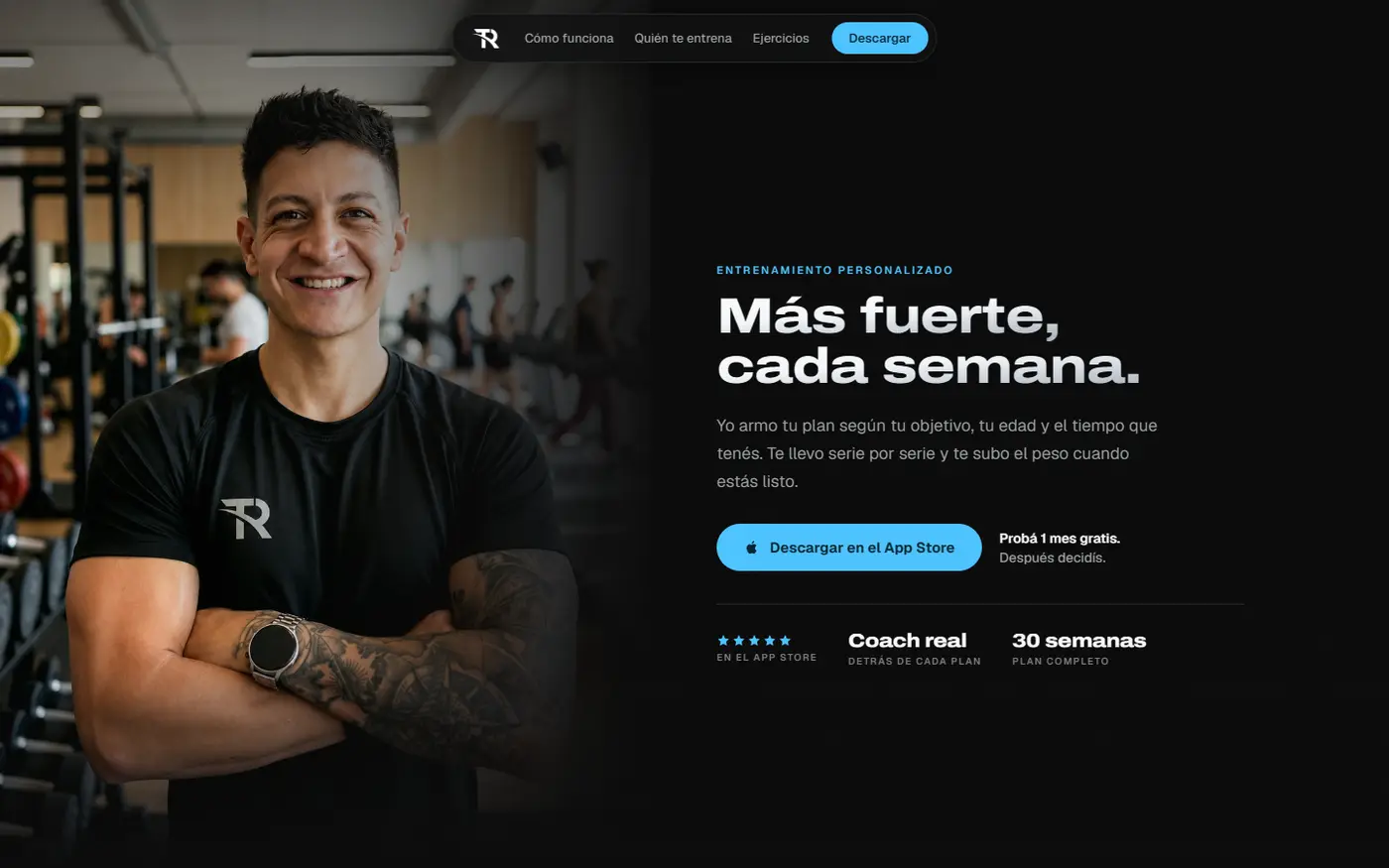
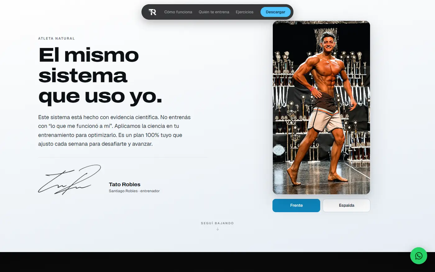
Una app con coach real no se vende como software: se vende como persona. El entrenador fue explícito: él arma cada rutina a mano, según objetivo, edad y tiempo disponible, y habla con cada cliente. Reescribimos el sitio entero en primera persona —la app pasó a ser el vehículo y no el protagonista— y la sección firma pasó a llamarse con sus palabras, sobrecarga progresiva, en vez de con la jerga del rubro. En paralelo pedimos material real con un brief preciso en vez de un pedido genérico: luz de costado y nunca frontal, porque la frontal aplana el músculo; sin selfies; cada escena en horizontal y en vertical, porque el sitio se ve más en celular. Llegaron dos fotos y dieciocho videos de técnica, todos reales, y son los que están hoy en el sitio.
Decidir qué se compra generado y qué se construye a mano, antes de gastar. El pedido para la pieza de portada eran cinco cosas: el teléfono girando con la app funcionando, el logo estampado, una gota que ondula el fondo, líneas de luz y mejor atmósfera. Separamos lo que puede alucinar de lo que no: tres de los cinco quedaron construidos a mano, porque ahí la app que se ve es la real, el logo es el logo y la nitidez no se degrada. Sólo compramos materia que no representa nada y por lo tanto no puede equivocarse —polvo, luz, destellos—. Y escribimos antes de gastar un techo de piezas y una regla de corte: tres pruebas, y si no salían dos utilizables se cerraba el camino entero. Sólo entró al sitio lo que pasó esa prueba.
Titulares en una display ancha y pesada, cuerpo en una neutral moderna. La display comparte el ADN del monograma de la marca —geométrica, ancha— y le da el golpe atlético que el producto necesita. Descartamos la tipografía del sitio anterior y también su logotipo como fuente de estilo: pertenecen a la marca que se estaba reemplazando. Las dos familias completas pesan 90 y 29 KB.
Sitio oscuro, con la paleta muestreada de la propia app. No inventamos una paleta ni usamos la del sitio anterior. Acá el oscuro no es una moda estética: es la identidad real del producto que se está vendiendo. Y el acento es uno solo, medido: sobre la captura real de la app, el celeste está 16 a 1 sobre el dorado —6,30% de píxeles fríos contra 0,38% cálidos—, así que darle una sección entera al dorado habría invertido la jerarquía real de la marca por un detalle que en el producto ocupa menos del medio por ciento.
La pantalla del teléfono va siempre oscura, sin importar el fondo de la sección. El sitio alterna fondos oscuros y claros para que el scroll tenga pulso sin meter un segundo color. El hallazgo fue que el teléfono oscuro sobre una sección clara se recorta muchísimo más, así que el producto queda de punto focal sin ningún esfuerzo. Y se pinta oscuro siempre porque sobre fondo claro la interfaz se volvería blanca y estaríamos mostrando un producto que no existe.
Composición asimétrica, con el teléfono grande y cortado por el borde. Una composición centrada se lee como diapositiva. El teléfono creció casi al doble y lo dejamos salir del cuadro. El titular se queda toda la sección en vez de desvanecerse: el que se queda es patrón editorial, el que aparece y se va es cartel. El marco reproduce un modelo concreto y no un rectángulo redondeado, porque las capturas del cliente son exactamente la resolución de ese modelo: la proporción y los controles laterales son un dato, no un gusto.
La barra de treinta semanas sale del teléfono y se vuelve gráfico a ancho completo. Dentro de la pantalla cada semana mide seis píxeles: ilegible, justo cuando el punto de la sección es que treinta semanas se sientan como mucho. Afuera, además, da respiro después de una sección que es toda marco de dispositivo.
La foto de portada va entera, despejada con un degradado lineal. El camino obvio era recortar la figura para que flotara limpia sobre el negro, y eso costaba tres cosas que estaban sumando: el gimnasio real de fondo, que es credibilidad; el desenfoque, que es profundidad; y los bordes del pelo, donde todo recorte falla y se nota. Además el negro de su remera es prácticamente el del sitio, así que el torso se funde con el fondo y lo que emerge son la cara, los brazos y el logo que lleva en el pecho.
El sitio está en vivo, completo de punta a punta: portada con la foto real del entrenador, seis secciones de producto, cierre y pie. Reemplazó al sitio anterior, que hablaba de un negocio que ya no existe. Editar también es diseñar: la página se recortó de 21,6 a 14,4 pantallas de alto antes de publicar, sacando todo lo que repetía algo ya dicho.
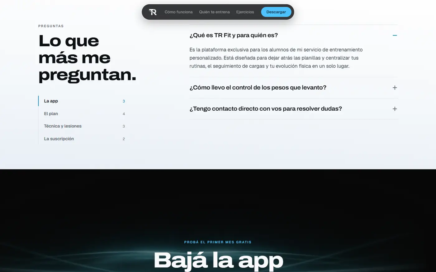
Todo lo que se ve de la app es la app real, reconstruida a partir de sus capturas, así que se lee nítida en cualquier pantalla y no hay una versión distinta para celular. Y el botón de descarga tenía un problema de fondo que resolvimos en vez de esconder: la app es exclusiva para quienes ya están en el servicio del coach, así que el sitio lo dice en las preguntas frecuentes y agrega un segundo camino, un enlace directo para escribirle antes de decidir.
TR Fit is a strength-training app built around a real coach: you get a plan built by hand and, at the end of every set, you declare how hard it felt. That changes the weight of the next set. The site exists to get downloads, not to sell the coaching service the old site sold.
The product's differentiator is not a screen: it is a decision the user makes after every set. A video shows a screen, not a decision. And that was exactly what had to land in three seconds.
There was nothing to show the product the site existed to sell. Of the twenty-eight files delivered, fifteen were unique and five were usable: four app screenshots and the logo. The six presentation videos showed interfaces that are not the app's and garbled words where it should have said Consistency or History: none was publishable or salvageable by editing. Rather than filming the app or generating it again, we rebuilt its interface inside the site itself, screen by screen, using the four real screenshots as an exact blueprint. What the visitor sees is the actual app, with its real text, sharp at any screen size and with no separate version for phones. Production cost of the material: zero.
Turning the user's decision into something understood without reading. We made that sequence the site's signature section and tied it to scroll in four stages: the finished set appears, the effort selector lights up, the next set's weight changes on screen, and the rest timer starts. The choreography was audited at ten points along the scroll, on desktop and phone, so no stage is left half-finished and there are no dead zones where scrolling advances and nothing happens.
An app built around a real coach does not sell as software: it sells as a person. The coach was explicit: he builds every routine by hand, based on goal, age and available time, and talks to every client. We rewrote the whole site in first person — the app became the vehicle, not the star — and the signature section took his words, progressive overload, instead of the industry's jargon. In parallel we asked for real material with a precise brief rather than a generic request: side lighting and never frontal, because frontal flattens muscle; no selfies; every scene shot horizontal and vertical, because the site is seen more on phones. Two photos and eighteen technique videos arrived, all real, and they are the ones on the site today.
Deciding what to buy generated and what to build by hand, before spending. The brief for the opening piece had five parts: the phone rotating with the app running, the stamped logo, a droplet rippling the background, light streaks and better atmosphere. We separated what can hallucinate from what cannot: three of the five were built by hand, because there the app you see is the real one, the logo is the logo, and sharpness does not degrade. We only bought matter that represents nothing and therefore cannot be wrong — dust, light, optical flares. And we wrote down before spending a ceiling of pieces and a cut rule: three probes, and if two were not usable the whole route closed. Only what passed that test made it onto the site.
Headings in a wide, heavy display face; body in a modern neutral. The display shares the DNA of the brand's monogram — geometric, wide — and gives the product the athletic hit it needs. We ruled out the old site's typeface and its wordmark as a source of style: both belong to the brand being replaced. The two complete families weigh 90 and 29 KB.
A dark site, with the palette sampled from the app itself. We did not invent a palette or reuse the old site's. Here dark is not an aesthetic trend: it is the real identity of the product being sold. And there is a single accent, measured: on the app's actual screenshot, the blue runs 16 to 1 over the gold — 6.30% cool pixels against 0.38% warm — so giving gold a whole section would have inverted the brand's real hierarchy for a detail that occupies less than half a percent of the product.
The phone screen always renders dark, whatever the section behind it. The site alternates dark and light backgrounds so the scroll has pulse without introducing a second colour. The finding was that a dark phone on a light section stands out far more, so the product becomes the focal point with no effort at all. And it always paints dark because on a light ground the interface would turn white and we would be showing a product that does not exist.
Asymmetric composition, with the phone large and cut off by the edge. A centred composition reads like a slide. The phone nearly doubled in size and we let it run off the frame. The heading stays for the whole section instead of fading: one that stays is an editorial pattern, one that appears and leaves is a billboard. The frame reproduces a specific model rather than a rounded rectangle, because the client's screenshots are exactly that model's resolution: the proportion and the side controls are data, not taste.
The thirty-week bar leaves the phone and becomes a full-width graphic. Inside the screen each week measures six pixels: illegible, precisely when the point of the section is that thirty weeks should feel like a lot. Outside, it also gives breathing room after a section that is all device frame.
The cover photo runs whole, cleared with a linear gradient. The obvious route was to cut the figure out so it floated clean on black, and that cost three things that were adding up: the real gym behind him, which is credibility; the depth of field, which is depth; and the hair edges, where every cut-out fails and it shows. His shirt's black is also practically the site's black, so the torso melts into the ground and what emerges is the face, the arms and the logo on his chest.
The site is live, complete end to end: a homepage with the coach's real photo, six product sections, a closing and a footer. It replaced the previous site, which talked about a business that no longer exists. Editing is design too: the page was cut from 21.6 to 14.4 screens tall before publishing, removing everything that repeated something already said.
Everything you see of the app is the real app, rebuilt from its screenshots, so it reads sharp on any screen and there is no separate phone version. And the download button had an underlying problem we solved rather than hid: the app is exclusive to people already in the coach's service, so the site says so in its FAQ and adds a second path, a direct link to message him before deciding.
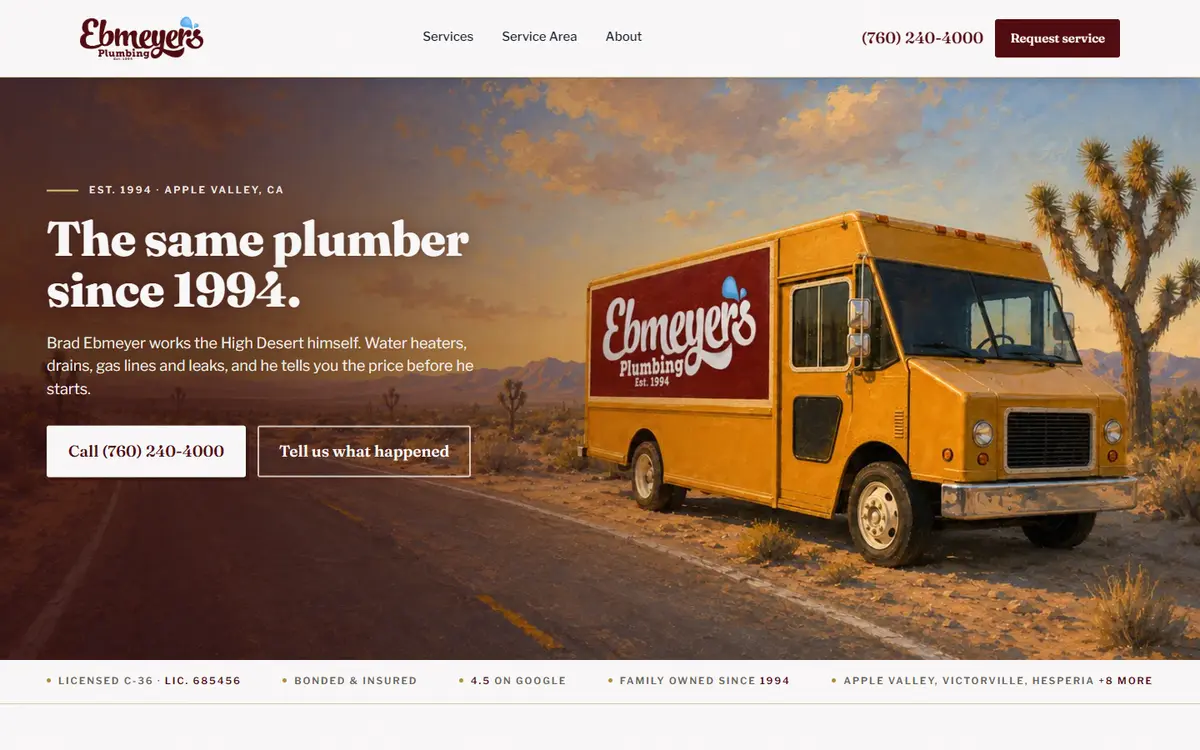
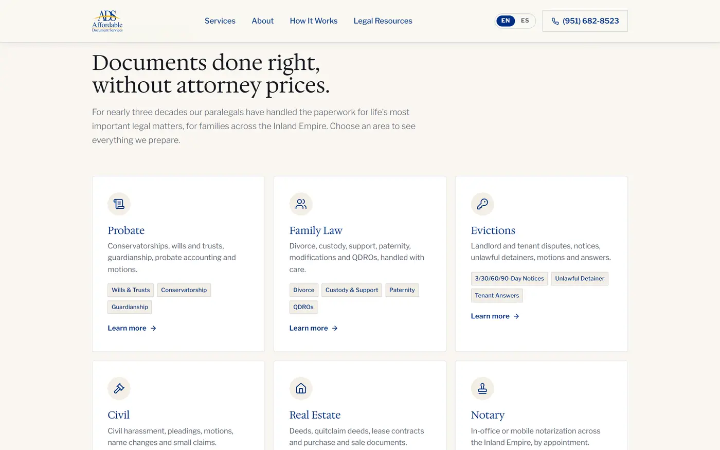
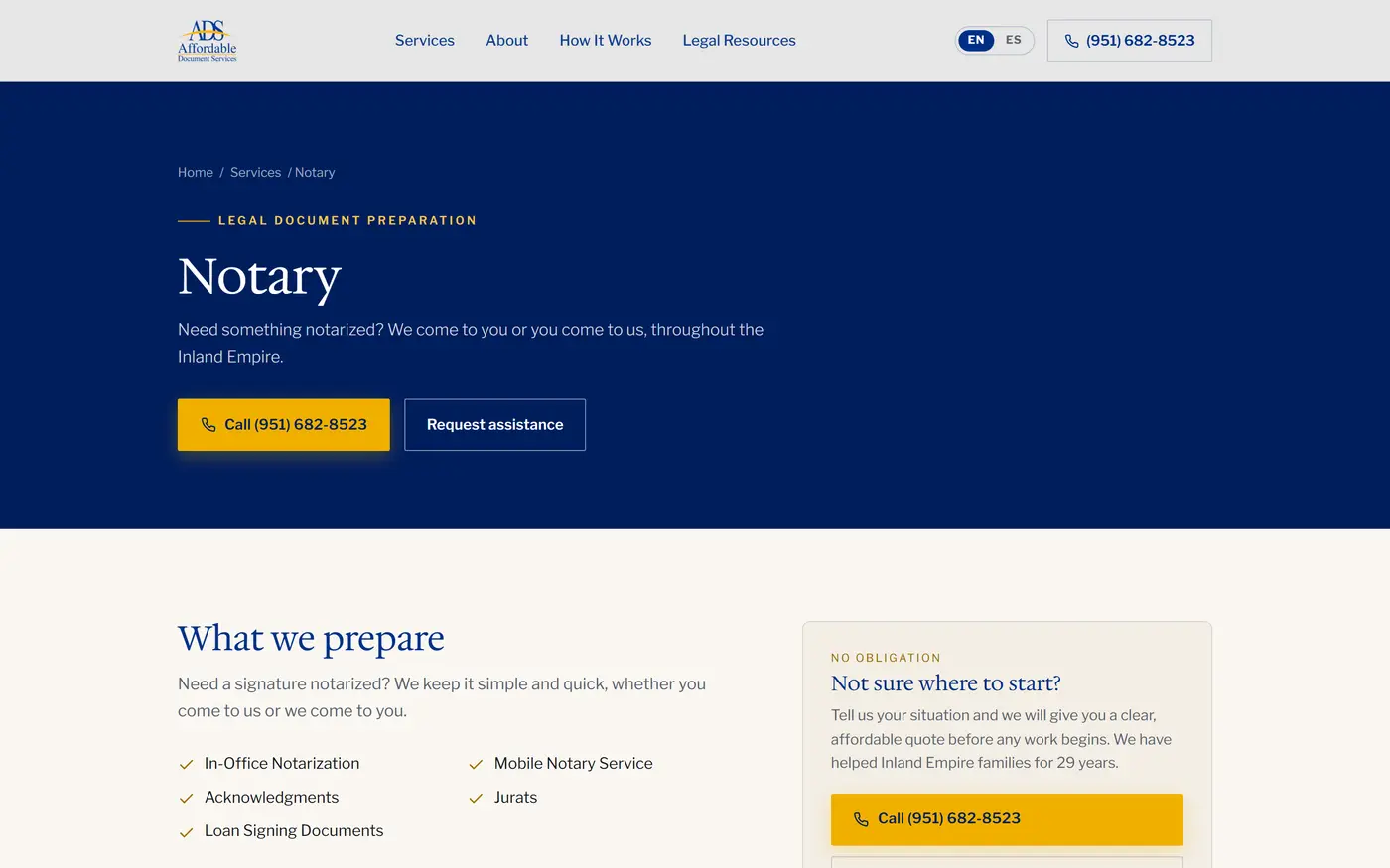
Affordable Document Services es un estudio de asistencia documental legal en Riverside, California, fundado en 1997. Su dueña es una Asistente de Documentos Legales registrada y afianzada: prepara y presenta ante los tribunales los documentos que alguien necesita para divorciarse, tramitar una sucesión, iniciar un desalojo o transferir una propiedad, sin ser abogada y sin dar asesoramiento legal. Su cliente es alguien del Inland Empire con un problema legal concreto que no puede pagar un abogado.
Lo que había antes funcionaba como una tarjeta: nombre, teléfono y poco más. No explicaba qué es una Asistente de Documentos Legales, no listaba los trámites y no ofrecía otro contacto que llamar. Veintinueve años habían construido una reputación que vivía en la memoria de los clientes anteriores, y cuando esa red no producía consultas no había ningún otro canal. Lo que pidió la clienta, textual, fue: «que la gente entienda que no soy abogada pero que sé lo que hago». Esa frase terminó siendo el criterio de toda la pieza.
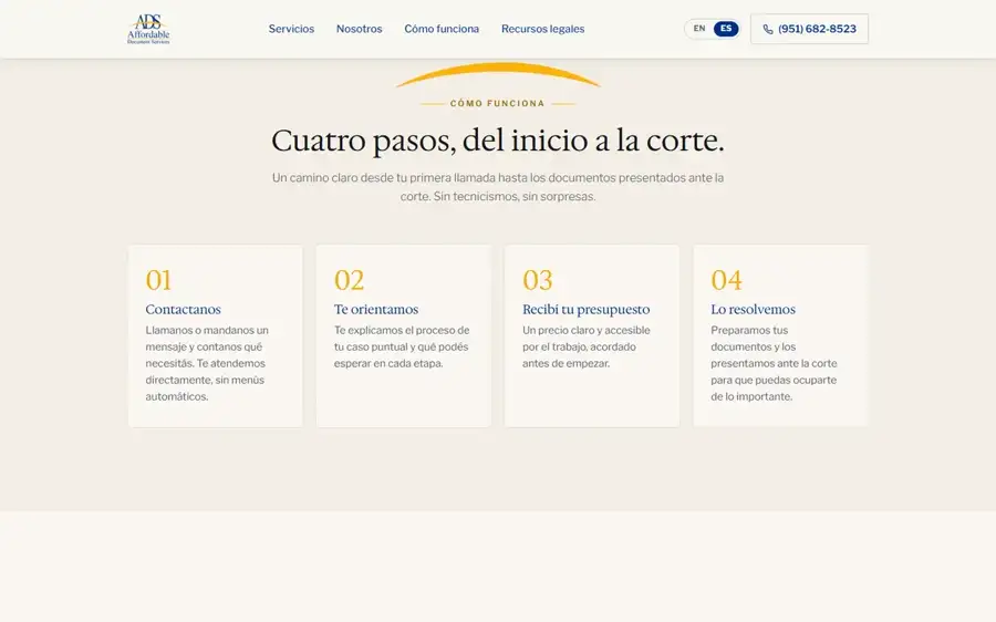
Vender una categoría que nadie sabe que existe. La mayoría cree que hay dos caminos: pagar un abogado o arreglárselas solo. La categoría intermedia es desconocida, y nadie busca lo que no sabe nombrar. Estructuramos el sitio alrededor del momento de necesidad —«me estoy divorciando», «murió mi papá», «tengo que desalojar»— en vez de alrededor de la profesión, con el mecanismo explicado en cuatro pasos desde la portada y el contenido entrando por la pregunta, no por el servicio.
Construir autoridad sin poder prometer nada. La regulación prohíbe garantizar resultados, prohíbe asesorar y además obliga a exhibir un descargo. Un sitio que genera confianza normalmente se apoya en promesas, y acá estaban vedadas. Apoyamos la autoridad en hechos verificables —año de fundación, número de registro, condición de afianzada, el hecho de que presenta ella misma los documentos— y diseñamos el descargo obligatorio como credencial visible y bien compuesta, no como letra chica. Lo que la ley obliga a decir terminó funcionando como argumento de venta.
La palabra prohibida. En español hay una trampa específica: «notario» designa a un abogado en casi toda América Latina, y la ley de California prohíbe que quien no es abogada la use para promocionarse. Pero es justamente la palabra que el cliente hispanohablante busca. Lo resolvimos nombrando siempre el acto —«notarización»— y nunca a la persona, auditando línea por línea todo el vocabulario en español contra esa restricción.
Dos idiomas sin partir el sitio en dos. Un conmutador que cambia el texto en pantalla es invisible para los buscadores: hay una sola dirección y el español no se indexa nunca. Duplicar el sitio duplica el mantenimiento y arriesga penalización por contenido repetido. Le dimos a cada idioma su propia dirección, hicimos que cada página llegue ya escrita en vez de armarse en el navegador, y que cada versión declare cuál es su equivalente. Veintisiete páginas indexables, siete de ellas en español, una sola pieza que mantener y un peso apenas seis por ciento mayor que el sitio monolingüe.
Decidir dónde invertir sin ningún dato histórico. No había analítica previa ni idea de qué servicio genera más demanda, e invertir en publicidad así es apostar. Lo hicimos al revés: primero la medición de consultas y llamadas, después un programa de investigación —demanda por servicio y por idioma, competencia local, estacionalidad, referencias de costo del rubro, listas de exclusión y marco regulatorio de la publicidad legal— y recién entonces la estrategia.
Tipografía. Títulos en Hedvig Letters Serif, una serif de un solo peso, con interlineado 1.05. Texto en Libre Franklin, de 300 a 700, a 1rem con interlineado 1.65. Descartamos una serif de serifas gruesas tipo slab, que lee como litigio y agresión, lo contrario del posicionamiento; y descartamos resolver todo con una sola sans, correcto pero sin ninguna señal de antigüedad. La serif aporta los veintinueve años, la sans la claridad de trámite.
Color. Fondo crema #FAF7F1, con dos escalones más para separar secciones. Azul institucional #003087, con una variante profunda para los fondos oscuros. Y un dorado #F0B000 como único acento, con una versión oscurecida para cuando funciona como texto sobre claro y necesita contraste legible. Descartamos el blanco puro con grises fríos, que es el default del rubro y produce frialdad clínica: el crema hace que la página se lea como papel, que es literalmente el producto. El dorado entra como calidez que compensa la dureza del azul de tribunal.
Forma, espacio y ritmo. Radio de esquina de 2 píxeles en todo el sistema: descartamos el radio grande y redondeado, que lee como aplicación de consumo y erosiona la señal institucional. Contenedor de 1200 píxeles con márgenes laterales elásticos entre 20 y 64 según el ancho. Y un solo elemento repetido ordena todas las secciones: el antetítulo en mayúsculas, con espaciado de letra de 0.22em y una regla dorada de 34 píxeles a la izquierda.
Movimiento. Los bloques aparecen con un desplazamiento vertical de 26 píxeles en 0,8 segundos, escalonados de a 80 milisegundos. La barra superior mide 84 píxeles y pasa de transparente sobre la fotografía a crema translúcido con desenfoque al desplazarse, cambiando el logotipo de blanco a azul en el mismo gesto. El criterio, en una línea: que el movimiento acompañe la lectura y nunca la interrumpa.
Fotografía. Ambientes y personas reales. Descartamos de plano el repertorio visual del rubro —martillos, balanzas, columnas, bibliotecas de tomos— porque es iconografía de abogado, y todo el proyecto se sostiene sobre la distinción de que ella no lo es.
El estudio pasó de una tarjeta digital a veintisiete páginas indexables en dos idiomas, con los seis servicios explicados en detalle y doce artículos que responden las preguntas previas a la contratación. El español no es una traducción oculta: son siete direcciones propias que un buscador puede mostrarle a quien busca en ese idioma, en un condado donde lo habla una porción enorme del mercado.
Queda además un sistema visual documentado —paleta, tipografía, escala de espaciado, criterio fotográfico y de movimiento— que permite sumar páginas sin volver a decidir nada. Y por primera vez en veintinueve años el negocio puede responder lo que antes era imposible: cuántas consultas llegan, por qué vía, desde qué servicio y en qué idioma.
Affordable Document Services is a legal document assistance practice in Riverside, California, founded in 1997. Its owner is a registered and bonded Legal Document Assistant: she prepares and files with the courts the documents someone needs to get divorced, settle an estate, start an eviction or transfer a property, without being an attorney and without giving legal advice. Her client is someone in the Inland Empire with a concrete legal problem who cannot afford a lawyer.
What existed before worked like a business card: name, phone and little else. It did not explain what a Legal Document Assistant is, did not list the filings, and offered no way to make contact other than calling. Twenty-nine years had built a reputation that lived in past clients' memories, and when that network was not producing enquiries there was no other channel. What the client asked for, in her words, was: "that people understand I am not a lawyer but that I know what I am doing". That sentence became the standard for the whole piece.
Selling a category nobody knows exists. Most people believe there are two routes: pay a lawyer or manage alone. The middle category is unknown, and nobody searches for what they cannot name. We structured the site around the moment of need — "I'm getting divorced", "my father died", "I need to evict" — rather than around the profession, with the mechanism explained in four steps from the homepage and the content entering through the question, not the service.
Building authority without being able to promise anything. Regulation forbids guaranteeing outcomes, forbids giving advice, and on top of that requires a disclaimer on display. A site that builds trust normally leans on promises, and here they were off limits. We rested the authority on verifiable facts — year founded, registration number, bonded status, the fact that she files the documents herself — and designed the mandatory disclaimer as a visible, well-composed credential rather than fine print. What the law obliges you to say ended up working as a sales argument.
The forbidden word. Spanish carries a specific trap: "notario" means a lawyer across most of Latin America, and California law forbids a non-attorney from using it to advertise. But it is exactly the word the Spanish-speaking client searches for. We solved it by always naming the act — "notarización" — and never the person, auditing every line of the Spanish vocabulary against that restriction.
Two languages without splitting the site in two. A switch that changes the text on screen is invisible to search engines: there is one address and the Spanish never gets indexed. Duplicating the site doubles maintenance and risks a duplicate-content penalty. We gave each language its own address, made every page arrive already written rather than assembled in the browser, and had each version declare its counterpart. Twenty-seven indexable pages, seven of them in Spanish, one single piece to maintain, and a weight barely six per cent above the monolingual site.
Deciding where to invest with no historical data. There was no prior analytics and no idea which service generates the most demand, and investing in advertising like that is gambling. We did it the other way around: first the measurement of enquiries and calls, then a research programme — demand by service and by language, local competition, seasonality, cost benchmarks for the trade, exclusion lists and the regulatory frame for legal advertising — and only then the strategy.
Type. Headings in Hedvig Letters Serif, a single-weight serif, with 1.05 line height. Body in Libre Franklin, 300 to 700, at 1rem with 1.65 line height. We ruled out a heavy slab serif, which reads as litigation and aggression, the opposite of the positioning; and ruled out solving everything with one sans, correct but with no signal of longevity. The serif carries the twenty-nine years, the sans the clarity of paperwork.
Colour. A cream ground, #FAF7F1, with two further steps to separate sections. Institutional blue #003087, with a deeper variant for dark grounds. And a gold, #F0B000, as the single accent, with a darkened version for when it works as text on light and needs legible contrast. We ruled out pure white with cool greys, the category default, which produces clinical coldness: the cream makes the page read like paper, which is literally the product. The gold enters as warmth offsetting the hardness of courtroom blue.
Form, space and rhythm. A corner radius of 2 pixels across the whole system: we ruled out the large rounded radius, which reads as a consumer app and erodes the institutional signal. A 1200-pixel container with elastic side margins between 20 and 64 depending on width. And a single repeated element orders every section: the eyebrow in caps, with 0.22em letter spacing and a 34-pixel gold rule to its left.
Motion. Blocks arrive with a 26-pixel vertical shift over 0.8 seconds, staggered in 80-millisecond steps. The top bar is 84 pixels and moves from transparent over the photography to translucent cream with blur on scroll, switching the logo from white to blue in the same gesture. The rule, in one line: motion should accompany reading and never interrupt it.
Photography. Real rooms and real people. We ruled out the category's visual repertoire outright — gavels, scales, columns, shelves of legal volumes — because it is lawyer iconography, and the whole project rests on the distinction that she is not one.
The practice went from a digital business card to twenty-seven indexable pages in two languages, with its six services explained in detail and twelve articles answering the questions people ask before hiring. The Spanish is not a hidden translation: it is seven addresses of its own that a search engine can show to someone searching in that language, in a county where a large share of the market speaks it.
What also remains is a documented visual system — palette, type, spacing scale, photographic and motion criteria — that allows pages to be added without deciding anything again. And for the first time in twenty-nine years the business can answer what was previously impossible: how many enquiries arrive, through which channel, from which service and in which language.
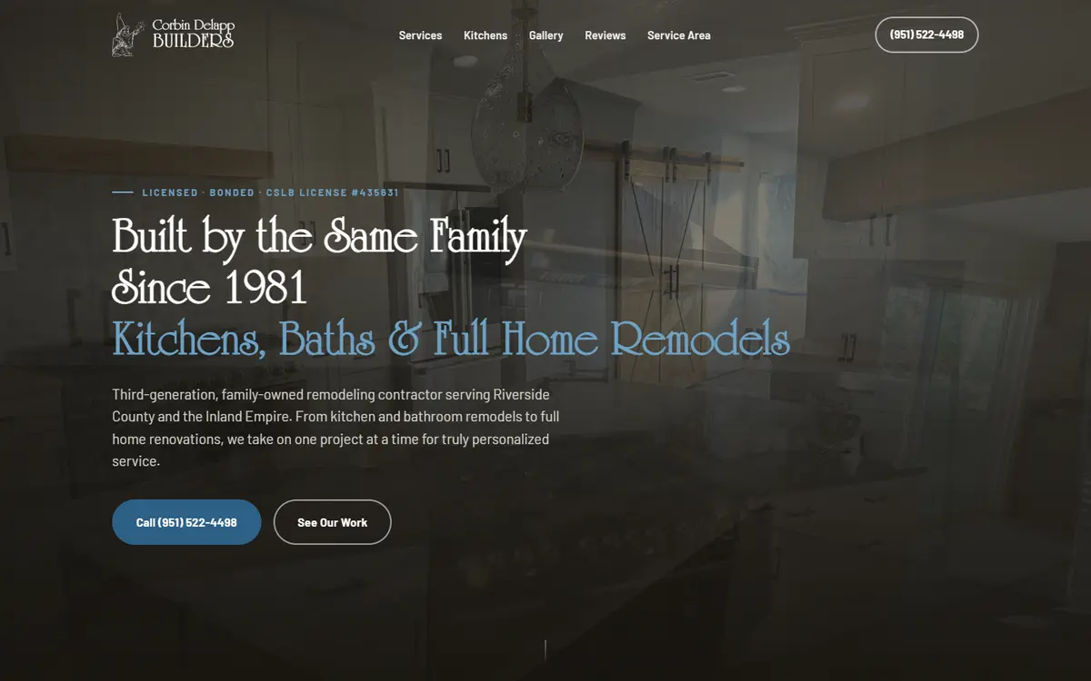
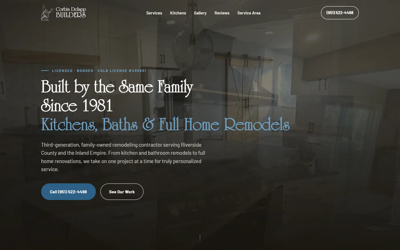
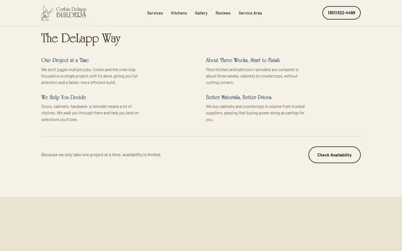
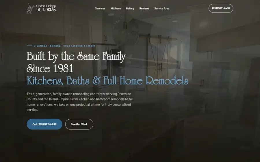
DeLapp Builders es una empresa familiar de remodelación en Riverside, California, en manos de la tercera generación de contratistas de la familia desde 1981. Cocinas, baños, gabinetes y remodelaciones completas, con un solo equipo y un proyecto a la vez. Vive del boca en boca: la reputación personal del dueño es, literalmente, el producto.
No tenía sitio. Su única presencia pública eran unas fotos sueltas en una red social, sin criterio de marca, y las reseñas de Google. Ese vacío le costaba plata: cada consulta dependía de que alguien ya lo conociera, sin forma de mostrar el volumen real de trabajo ni de generar confianza con quien nunca había oído hablar de él. El pedido fue directo: un sitio del nivel de otro que ya le gustaba, con identidad propia, no una plantilla genérica de contratista.
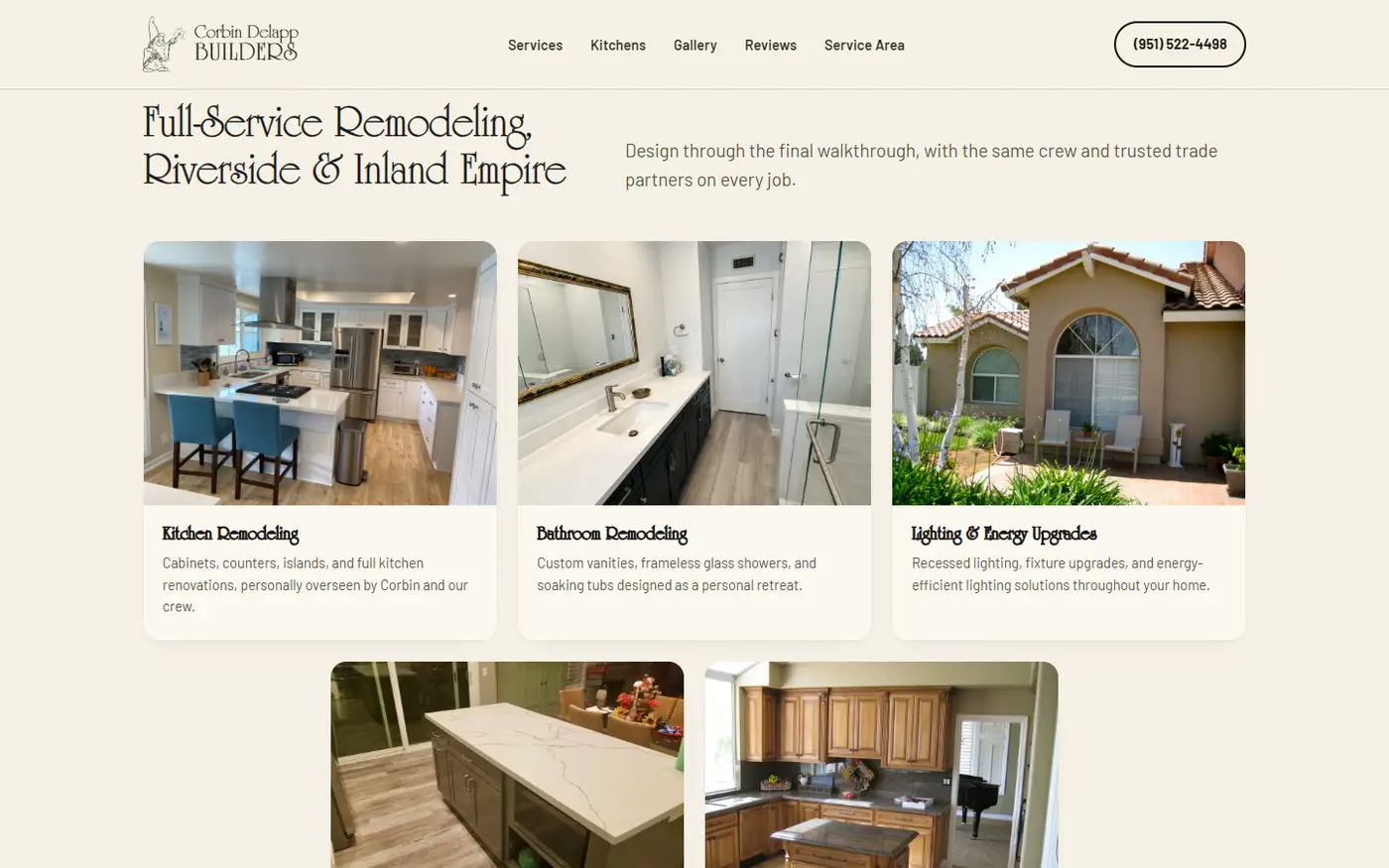
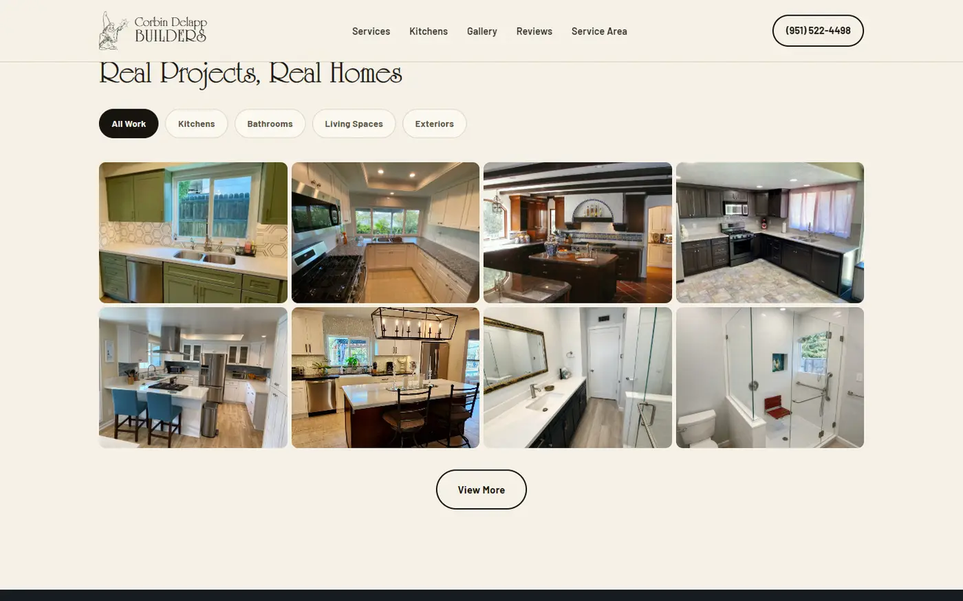
Ordenar más de cien fotos de obra sin que se conviertan en ruido. La familia entregó un archivo de más de cien fotografías reales, tomadas con teléfono y sin ningún orden. El problema no era mostrarlas: era decidir cuáles cuentan la historia correcta, evitar que tres ángulos del mismo ambiente saturen la grilla, y que la página siga cargando liviana en un celular. Dos pasadas de curación —primero descarte por calidad y duplicación, después clasificación por ambiente— dejaron una galería de 54 fotos en cuatro categorías, que se muestran de a ocho.
Blindar el lenguaje con lo que el negocio puede respaldar. Un contratista licenciado no se puede dar el lujo de que su propio sitio prometa de más. En la revisión aparecieron ajustes de precisión: un servicio que figuraba pero ya no formaba parte del negocio salió por completo, la forma de describir el trabajo de gabinetes se corrigió para reflejar exactamente cómo se fabrican e instalan, y el modo de hablar del equipo se ajustó a cómo se arma cada obra en la práctica. Cada una de esas frases cambia lo que un cliente espera el día que el contratista entra a su casa, así que se revisó línea por línea hasta que el texto dijera exactamente lo que el negocio sostiene.
Construir confianza suficiente para dejar entrar gente a tu casa durante semanas. Es una decisión que no se puede probar antes de tomarla, y el lenguaje del rubro está gastado: todos dicen ser el contratista de confianza. La construimos en capas concretas: la licencia estatal visible desde el primer scroll, la continuidad familiar de tres generaciones como argumento central de marca, y reseñas reales sin una sola inventada.
La identidad ya existía, sin que la familia lo supiera. Usaban informalmente el dibujo de un mago con varita, sin ningún sistema alrededor. En vez de diseñar una marca desde cero, lo tomamos como punto de partida y lo llevamos a identidad completa. La paleta siguió el mismo criterio: se descartó el verde salvia inicial y el azul cobalto salió de un azulejo español azul y blanco de una de sus propias cocinas, la misma foto que la familia ya había elegido como portada de su página. El color de la marca estaba adentro del trabajo.
Capturar consultas sin atar al cliente al estudio. Desde el principio se sabía que el sitio iba a terminar en un servidor de la familia, no en nuestra infraestructura. Eso puso una restricción real sobre el formulario: tenía que seguir funcionando sin depender de ninguna herramienta externa que ellos no pudieran operar después. Se resolvió con un sistema de envío autocontenido, alojado dentro del propio sitio, que entrega cada consulta directo a la casilla del negocio, sin cuentas de terceros que administrar.
Entregar el control sin entregar un manual de construcción. La familia decidió administrar el dominio y el servidor por su cuenta. Eso significaba dejar el sitio funcionando en su propio alojamiento con instrucciones suficientes para instalar actualizaciones futuras, sin convertir la documentación en un curso de cómo está hecha cada pieza. Cerró con el sitio migrado, verificado en el dominio final y una guía acotada a lo operativo.
Tipografía. Títulos en University Roman, de trazo fino y mucho carácter, elegida porque conecta directo con el ícono del mago. Cuerpo en Barlow, una sans neutra, para que los párrafos largos —reseñas, historia familiar— se lean livianos frente a un título con tanta personalidad. Es lo contrario de la sans genérica que usa casi todo el rubro.
Color. Azul cobalto #2D5F86, con variante clara #6FA3C7 y oscura #1F3F5C, sobre una base cálida de lino y crema (#F5F1E6 y #FBF8F1). Dos bloques oscuros cortan el recorrido y le dan respiración a una página larga. Se descartó el verde salvia de la primera paleta: el azul no se eligió por gusto, se extrajo del trabajo del propio cliente.
Fotografía. Cero fotos de banco y cero recreaciones: cada imagen es una obra real terminada, recortada a una proporción 4:3 consistente para que la grilla se vea prolija sin perder el carácter documental de una foto tomada en la obra.
Movimiento. La portada rota entre cuatro fotos con un cruce suave cada seis segundos y un zoom lento sobre cada una, para que la primera impresión no se sienta estática. El resto de la página se revela con una aparición suave al hacer scroll. Todo el movimiento se apaga para quien tiene configurada la reducción de movimiento en su dispositivo.
Estructura. Una sola página larga de recorrido narrativo: portada, trayectoria, servicios, el método de la familia, especialidad en cocinas, galería, historia, reseñas, zona de cobertura y cierre. El ancho de contenido se fijó en 1240 píxeles para que las fotos respiren sin perder intimidad de lectura.
DeLapp Builders pasó de no tener sitio a tener una presencia digital completa: una galería curada de 54 fotos reales organizadas por ambiente, un sistema de consultas que llega directo al correo del negocio sin pasos manuales, y una identidad de marca propia construida a partir de un símbolo que la familia ya sentía suyo.
El sitio está publicado y funcionando, alojado y administrado de forma completamente independiente por la familia. Ese era el objetivo desde el primer día, y condicionó decisiones que se tomaron meses antes: el formulario que no depende de nadie, y una documentación pensada para que puedan seguir solos.
DeLapp Builders is a family remodeling company in Riverside, California, run by the third generation of contractors in the family since 1981. Kitchens, bathrooms, cabinetry and full home remodels, with one crew and one project at a time. It lives on word of mouth: the owner's personal reputation is, literally, the product.
There was no website. Its only public presence was a handful of loose photos on a social page, with no brand criteria, plus its Google reviews. That gap cost the business money: every enquiry depended on someone already knowing him, with no way to show the real volume of work or build trust with anyone who had never heard of him. The brief was direct: a site on the level of another one he already liked, with an identity of its own, not a generic contractor template.
Ordering more than a hundred jobsite photos without turning them into noise. The family handed over an archive of a hundred-plus real photographs, shot on a phone and in no order. The problem was not showing them: it was deciding which ones tell the right story, keeping three angles of the same room from saturating the grid, and keeping the page light on a phone. Two curation passes — first discarding for quality and duplication, then classifying by room — produced a gallery of 54 photos in four categories, shown eight at a time.
Making the language match what the business can back up. A licensed contractor cannot afford a site that over-promises. The review surfaced precision fixes: a service listed but no longer part of the business was removed entirely, the description of the cabinetry work was corrected to reflect exactly how it is built and installed, and the way the crew is described was adjusted to how each job is actually staffed. Every one of those sentences changes what a client expects the day the contractor walks into their house, so it was reviewed line by line until the text said exactly what the business stands behind.
Building enough trust to let people into your home for weeks. It is a decision you cannot test before making it, and the category's language is worn out: everyone claims to be the contractor you can trust. We built it in concrete layers: the state license visible from the first scroll, three generations of family continuity as the central brand argument, and real reviews with none invented.
The identity already existed, and the family did not know it. They informally used a drawing of a wizard with a wand, with no system around it. Rather than design a brand from scratch, we took it as the starting point and built it out into a full identity. The palette followed the same logic: the initial sage green was dropped and the cobalt blue came from a blue-and-white Spanish tile in one of his own kitchens — the very photo the family had already chosen as their page's cover. The brand's colour was inside the work.
Capturing enquiries without tying the client to the studio. From the start we knew the site would end up on the family's own server, not our infrastructure. That put a real constraint on the contact form: it had to keep working without depending on any outside tool they could not operate later. We solved it with a self-contained submission system, hosted inside the site itself, delivering each enquiry straight to the business's inbox, with no third-party accounts to administer.
Handing over control without handing over a construction manual. The family chose to run the domain and the server themselves. That meant leaving the site working on their own hosting with enough instructions to install future updates, without turning the documentation into a course on how every piece was made. It closed with the site migrated, verified on the final domain, and a guide kept to the operational essentials.
Type. Headings in University Roman, thin-stroked and full of character, chosen because it connects directly to the wizard mark. Body in Barlow, a neutral sans, so long paragraphs — reviews, family history — read light against a heading with that much personality. It is the opposite of the generic sans almost the whole category uses.
Colour. Cobalt blue #2D5F86, with a light variant #6FA3C7 and a dark one #1F3F5C, over a warm base of linen and cream (#F5F1E6 and #FBF8F1). Two dark blocks break the journey and give a long page room to breathe. The first palette's sage green was dropped: the blue was not chosen by taste, it was extracted from the client's own work.
Photography. Zero stock and zero recreations: every image is a real finished job, cropped to a consistent 4:3 so the grid reads tidy without losing the documentary character of a photo taken on site.
Motion. The homepage rotates through four photos with a soft crossfade every six seconds and a slow zoom on each, so the first impression does not feel static. The rest of the page reveals with a gentle entrance on scroll. All motion switches off for anyone with reduced motion enabled on their device.
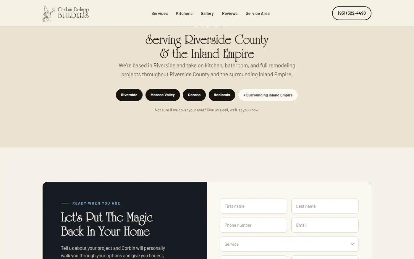
Structure. One long narrative page: hero, track record, services, the family's method, kitchen specialism, gallery, history, reviews, coverage area and close. Content width was fixed at 1240 pixels so the photos breathe without losing reading intimacy.
DeLapp Builders went from having no site to a complete online presence: a curated gallery of 54 real photos organised by room, an enquiry system that arrives straight in the business's inbox with no manual steps, and a brand identity built from a symbol the family already felt was theirs.
The site is published and running, hosted and administered entirely independently by the family. That was the goal from day one, and it shaped decisions taken months earlier: the form that depends on nobody, and documentation written so they can carry on alone.
Ebmeyer's Plumbing es un servicio de plomería familiar en Apple Valley, California. Lo atiende una sola persona, con matrícula estatal activa desde 1994, en una zona extensa y de baja densidad que cubre cerca de diez localidades del High Desert. Pérdidas, destapaciones, calefones y cañerías: emergencias y trabajos programados.
Antes había un sitio armado sobre una plantilla genérica: una franja superior color vino, un fondo con ondas celestes sin relación con el oficio, una insignia circular de «llamar ahora» y tres enlaces sueltos sobre texto plano. Cumplía la función de estar online, pero no comunicaba nada del oficio ni de la persona detrás. El negocio necesitaba algo más urgente que estética: una forma de convertir a alguien con un problema doméstico real en una llamada, en el momento exacto en que está decidiendo a quién llamar.
La urgencia como principio de diseño. A un plomero se lo busca con el agua corriendo por el piso: es un rubro donde la decisión de compra puede tomar segundos en vez de días. Eso obligó a invertir el orden habitual de un sitio. El teléfono y el triage de problemas quedaron arriba de todo, antes que cualquier presentación institucional, y se sacó del camino todo lo que un visitante apurado no necesita decidir en ese momento.
El sistema ya existía, en la cabeza del plomero. Lo único que el cliente pidió conservar explícitamente fueron sus cinco categorías de problema: las que ya usaba para triar pedidos por teléfono, porque le funcionaban en la calle aunque nunca las hubiera pensado como una pieza de diseño. En vez de reemplazarlas por un formulario genérico, se convirtieron en la primera pantalla del sitio. Cada categoría manda el pedido directo, con la dirección y la urgencia ya cargadas.
Prometer el precio antes de empezar, en un rubro que no lo hace. El sitio se construyó alrededor de decir el costo antes de arrancar el trabajo, que es lo contrario de la práctica habitual del oficio. Sostener esa promesa sin poder cotizar a ciegas exigió resolverla como proceso —qué pasos siguen a un pedido— y no como una cifra fija imposible de garantizar de antemano.
Un negocio de una sola persona, sin que se lea como una limitación. El mismo hombre atiende desde 1994: es un activo de confianza enorme y a la vez un techo real de capacidad. Construimos el mensaje sobre la continuidad y el trato directo, sin caer en el lenguaje de «equipo» o «cuadrilla» que no existe, ni prometer una disponibilidad permanente que tampoco es real. Y la zona de servicio se fijó con un criterio explícito de hasta qué localidades listar, en vez de exagerarla para parecer más grande de lo que la operación sostiene.
Mostrar un oficio que casi no se ve. Gran parte del trabajo de un plomero pasa debajo de una pileta o dentro de una pared, y no había material fotográfico de trabajos reales. Lo resolvimos con un sistema de tres niveles: motivos gráficos simples para ambientar, ilustración pintada para explicar objetos y procesos, y fotografía real reservada exclusivamente para lo que prueba que el negocio existe —la camioneta, la matrícula pública, las reseñas genuinas—. La regla fue estricta: la ilustración explica, nunca simula competencia.
Una de esas ilustraciones llegó con un tramo del grabado ilegible, y había que corregirlo sin perder la textura de aguafuerte del resto de la pieza. Se reconstruyó a mano, repitiendo y ajustando curva por curva secciones limpias del propio grabado, hasta que el remiendo quedó invisible incluso de cerca.
Tipografía. Un par de dos familias. Titulares con ecos de la rotulación comercial americana de mediados de siglo —la misma tradición de la que salen el logotipo cursivo del negocio y el rotulado de la camioneta— y un cuerpo en una gótica de líneas limpias, en la línea de los catálogos de ferretería clásicos: legible, sin adornos, hecha para leerse rápido.
Color. Paleta acotada a cinco tonos: un rojo oxblood profundo como color de marca, un mostaza cálido como acento, un papel casi blanco de fondo, una tinta oscura para el texto, y un celeste de agua reservado exclusivamente para los motivos de gotas y pérdidas, nunca usado como color general de interfaz, para que mantenga su carga de significado.
Movimiento. Intensidad deliberadamente moderada en todo el sitio, con una sola excepción: una sección que se ancla en pantalla mientras el visitante baja, y en la que una pérdida de agua avanza a medida que se desplaza. Dramatiza en el momento justo la sensación de urgencia que trae a alguien al sitio, sin convertir el resto de la experiencia en un espectáculo.
Estructura. Orden pensado de lo urgente a lo considerado: el triage de problemas primero, los servicios después, la prueba de confianza —matrícula, antigüedad, reseñas— a mitad de camino, y el formulario de contacto siempre a un scroll de distancia.
El sitio está en vivo en el dominio propio del negocio, indexado en buscadores, y recibiendo pedidos reales a través del formulario, que llegan de inmediato al dueño con la dirección y la urgencia ya cargadas.
Cada etapa se aprobó sobre capturas reales antes de publicar, y quedó documentación clara de los términos del servicio para que no haya ambigüedad sobre qué incluye y qué no. El negocio pasó de una plantilla que sólo cumplía con estar online a una pieza que trabaja en el momento exacto en que alguien decide a quién llamar.
Ebmeyer's Plumbing is a family plumbing service in Apple Valley, California. It is run by one person, licensed by the state since 1994, across a wide, low-density area covering around ten towns in the High Desert. Leaks, drains, water heaters and pipework: emergencies and scheduled jobs alike.
Before, there was a site built on a generic template: a wine-coloured top band, a background of pale blue waves with no relation to the trade, a circular "call now" badge, and three loose links over plain text. It did the job of being online, but it communicated nothing about the trade or the person behind it. The business needed something more urgent than aesthetics: a way to turn someone with a real household problem into a phone call, at the exact moment they are deciding who to call.
Urgency as a design principle. You look for a plumber with water running across the floor: this is a trade where the buying decision can take seconds instead of days. That meant inverting the usual order of a website. The phone number and the problem triage went above everything, ahead of any institutional introduction, and everything a hurried visitor does not need to decide right then was moved out of the way.
The system already existed, in the plumber's head. The one thing the client explicitly asked to keep was his five problem categories: the ones he already used to triage calls, because they worked in the field even though he had never thought of them as a piece of design. Instead of replacing them with a generic form, they became the site's first screen. Each category sends the request straight through, with the address and the urgency already attached.
Promising the price before starting, in a trade that does not. The site was built around stating the cost before the work begins, the opposite of standard practice in the trade. Holding that promise without quoting blind meant resolving it as a process — what steps follow a request — rather than as a fixed figure impossible to guarantee up front.
A one-person business, without it reading as a limitation. The same man has answered since 1994: an enormous trust asset and, at the same time, a real ceiling on capacity. We built the message on continuity and dealing directly with him, without the language of "team" or "crew" that does not exist, and without promising round-the-clock availability that is not real either. The service area was set with an explicit rule about which towns to list, rather than inflating it to look bigger than the operation can sustain.
Showing a trade that is mostly invisible. Much of a plumber's work happens under a sink or inside a wall, and there was no photographic record of real jobs. We solved it with a three-tier system: simple graphic motifs to set the scene, painted illustration to explain objects and processes, and real photography reserved exclusively for what proves the business exists — the truck, the public license, the genuine reviews. The rule was strict: illustration explains, it never simulates competence.
One of those illustrations arrived with an illegible passage in the engraving, and it had to be corrected without losing the etching texture of the rest of the piece. It was rebuilt by hand, repeating and adjusting clean sections of the engraving curve by curve, until the repair was invisible even up close.
Type. A pair of two families. Headlines echoing mid-century American commercial lettering — the same tradition the business's cursive logotype and the truck signwriting come from — with body text in a clean-lined gothic, in the vein of classic hardware catalogues: legible, unadorned, built to be read fast.
Colour. A palette held to five tones: a deep oxblood red as the brand colour, a warm mustard as accent, a near-white paper ground, a dark ink for text, and a water blue reserved exclusively for the drip and leak motifs, never used as a general interface colour, so it keeps its charge of meaning.
Motion. Deliberately moderate throughout, with one exception: a section that pins to the screen while the visitor scrolls, in which a water leak advances as they move down. It dramatises, at exactly the right moment, the urgency that brought someone to the site, without turning the rest of the experience into a spectacle.
Structure. Ordered from urgent to considered: the problem triage first, services next, the proof of trust — license, years, reviews — halfway down, and the contact form always one scroll away.
The site is live on the business's own domain, indexed in search, and receiving real requests through the form, which reach the owner immediately with the address and the urgency already attached.
Every stage was approved on real screens before publishing, and clear documentation of the service terms was left so there is no ambiguity about what is included and what is not. The business went from a template that merely existed online to a piece that works at the exact moment someone decides who to call.
FinancePro es una plataforma de finanzas para un negocio que cobra y paga en más de una moneda. No fue un encargo: se construyó para un problema propio, llevar a la vez las finanzas personales y las de una empresa que factura en dólares, gasta en pesos y opera en México.
Antes todo vivía en una planilla que se rehacía cada mes: una pestaña por cuenta, una por categoría, una de resumen y una columna de cotización actualizada a mano. Tres monedas, catorce cuentas, y una empresa cuyos movimientos había que separar de los personales fila por fila.
Lo que se rompía no era la eficiencia sino la confianza en los números. El pasado no se quedaba quieto: con una sola celda de cotización, actualizarla en agosto reescribía marzo, y eso vuelve imposible la pregunta más básica de un negocio, la de si este mes fue mejor que el anterior. El cierre llegaba bien entrado el mes siguiente, cuando la decisión que dependía de ese número ya se había tomado a ciegas. Y sin una regla escrita, un gasto de uso personal pagado con la cuenta de la empresa se resolvía distinto según el mes.
Comprar algo hecho no alcanzaba. Los agregadores personales asumen una moneda y un país, y no modelan una empresa. Las herramientas contables sí la modelan, pero son de registro: miran hacia atrás, y su multi-moneda resuelve la conversión contable, no la pregunta del negocio. Ninguna acepta la premisa de origen: que la persona y la empresa son la misma economía, y hay que poder verlas juntas y separadas sin cambiar de herramienta.
La moneda de la verdad. Cada movimiento queda fijado al cambio del día en que ocurrió, y ese valor no se toca nunca más. Suena obvio, pero obliga a aceptar algo incómodo: los saldos históricos dejan de sumar contra la cotización de hoy. Las alternativas se descartaron por lo que rompían. Convertir todo al cambio actual, que es lo que hacía la planilla, da saldos coherentes hoy pero destruye la comparación entre meses. Un promedio del período suaviza los saltos, pero inventa un número que no ocurrió nunca e impide reconciliar contra un extracto real. La fecha del movimiento es la única que permite auditar: cada cifra corresponde a algo que pasó. Cuando hace falta el valor de hoy, se muestra aparte y etiquetado, sin reemplazar al original.
Personal y negocio sin un tablero aparte. Duplicar la aplicación en dos modos era lo fácil, y se descartó porque la mitad de las preguntas útiles cruzan los dos mundos. La pertenencia se resolvió como regla del modelo y no como filtro de pantalla: un movimiento es de la empresa si está marcado como tal o si vive en una cuenta que la empresa posee. Al ser una sola regla, ninguna pantalla puede contradecir a otra. Encima hay un único control de ámbito, y el usuario siempre sabe qué está mirando porque hay un solo lugar donde eso se elige.
Mostrar el futuro sin prometerlo. Proyectar obliga a separar lo comprometido, lo probable y lo supuesto. La proyección se arma sobre lo ya registrado y se dibuja siempre punteada frente a las líneas sólidas del pasado: esa distinción hace el trabajo que un descargo no hace, porque nadie confunde una línea punteada con un hecho. Al lado hay un simulador donde se cambia un supuesto, un cliente que paga tarde o un gasto fijo nuevo, y se ve el efecto. Es una herramienta para pensar, no un pronóstico para creer.
La densidad. Una pantalla de finanzas tiene muchos números y se vuelve ilegible. Se resolvió en tres niveles: cuatro cifras grandes arriba que contestan «cómo vengo» de un vistazo; abajo, secciones plegables que responden una pregunta cada una y recuerdan si las dejaste abiertas; y adentro, el detalle. Lo secundario no se elimina, se pliega. Todas las secciones comparten la misma anatomía, de modo que la posición de los controles no cambia nunca.
El color que ya significa algo. En finanzas el verde y el rojo están ocupados: son ingreso y egreso. Eso obligó a sacarlos del juego para todo lo demás, así que la paleta de series se construyó sin ninguno de los dos y se validó como conjunto sobre fondo blanco para el caso más exigente, una torta donde cada porción toca a todas las otras, comprobando también su separación bajo daltonismo. Donde un número es bueno o malo según el contexto, el color nunca viaja solo: lo acompaña una palabra o un porcentaje.
Que cargar no sea una tarea. Toda herramienta de finanzas muere el día en que se deja de cargar. El formulario propone la fecha de hoy, la cuenta más usada y el cambio del día ya resuelto, sugiere la categoría según lo que se escribió, y adjunta la factura en el mismo paso leyendo sus datos.
Tipografía. Una sola familia para texto e interfaz, Geist en cuatro pesos, con los títulos de interletrado ajustado. Para toda cifra, Geist Mono. Se descartó una serif de display en los títulos: daba carácter, pero peleaba con la lectura de tablas densas.
Color. Fondo de página #F6F7F9, un blanco roto levemente frío y no un gris neutro; tarjetas en blanco puro para que floten sin necesidad de sombra fuerte; tinta #0A0B0F, bordes #E1E4EA, texto secundario #6C717F. Un único acento, azul eléctrico #0A60FF, con su lavado #EBF2FF para estados activos. Semánticos: egreso #E4494C, ingreso #0D9668. Las series de gráfico van en orden fijo y nunca cíclico. Se descartó la barra lateral azul oscuro del principio: le robaba peso al único acento y hacía que todo lo demás pareciera apagado.
Los números. Es donde se jugó más detalle. Toda cifra va en tipografía monoespaciada con cifras tabulares, de modo que las columnas se alinean por posición y un monto no cambia de ancho al actualizarse. Los importes van siempre alineados a la derecha. Un negativo no se muestra entre paréntesis, como en la contabilidad clásica, porque es ilegible para quien no es contador: va con signo menos y en rojo. Y un monto en moneda extranjera se muestra en su propia moneda, grande y con su símbolo, y debajo, en cuerpo menor y color secundario, el equivalente en dólares precedido de un ≈: ese símbolo dice «esto es una aproximación de hoy» y evita que alguien lo lea como el monto real.
Espaciado y forma. Escala de 4 píxeles con saltos en 4, 8, 12, 16 y 24. Radio base de 12 píxeles, 16 en tarjetas y 8 en controles internos; todos los campos de formulario comparten un mismo radio para que ninguno parezca de otra familia. Sombra mínima: separa el borde, no la sombra.
Navegación y movimiento. Barra lateral fija con tres grupos en vez de una lista larga; se descartaron las pestañas superiores, que con nueve destinos obligaban a un menú desbordado. Del movimiento, casi nada: transiciones de color de 150 ms y el despliegue de las secciones, sin animaciones de entrada en los números, que en una herramienta que se abre veinte veces por día molestan.
FinancePro está en uso diario desde marzo, sin interrupciones, llevando en un solo lugar tres monedas, catorce cuentas y la separación entre lo personal y lo de la empresa.
La planilla que se rehacía cada mes ya no existe. Los meses cerrados dejaron de moverse, y uno cerrado hoy vale lo mismo dentro de un año, lo que hizo posible por primera vez comparar períodos, de semanas a años, en un mismo gráfico. Si el negocio es rentable por separado dejó de depender de una revisión fila por fila y pasó a ser una regla del sistema. Y el cierre de mes dejó de ser una tarea de planilla: hoy es un reporte que se genera con sus comprobantes.
FinancePro is a finance platform for a business that bills and pays in more than one currency. It was not a commission: it was built for a problem of my own, running personal finances alongside those of a company that bills in dollars, spends in pesos and operates in Mexico.
Before, everything lived in a spreadsheet rebuilt every month: a tab per account, one per category, one summary, and an exchange-rate column updated by hand. Three currencies, fourteen accounts, and a company whose entries had to be separated from the personal ones row by row.
What broke was not efficiency but trust in the numbers. The past would not hold still: with a single exchange-rate cell, updating it in August rewrote March, and that makes the most basic question in a business impossible, whether this month was better than the last. The close arrived well into the following month, when the decision that depended on that number had already been made blind. And with no written rule, a personal expense paid from the company account was resolved differently depending on the month.
Buying something off the shelf was not enough. Personal aggregators assume one currency and one country, and do not model a company. Accounting tools do model it, but they are systems of record: they look backwards, and their multi-currency solves the accounting conversion, not the business question. None accepts the founding premise: that the person and the company are the same economy, and you have to be able to see them together and apart without switching tools.
The currency of truth. Every entry is fixed to the exchange rate of the day it happened, and that value is never touched again. It sounds obvious, but it forces you to accept something uncomfortable: historical balances stop adding up against today's rate. The alternatives were discarded for what they broke. Converting everything at the current rate, which is what the spreadsheet did, gives balances that are coherent today but destroys comparison between months. A period average smooths the jumps, but invents a number that never occurred and makes it impossible to reconcile against a real statement. The entry's own date is the only one that allows an audit: every figure corresponds to something that happened. When today's value is needed, it is shown separately and labelled, without replacing the original.
Personal and business without a separate dashboard. Duplicating the application into two modes was the easy path, and it was discarded because half the useful questions cross both worlds. Ownership was solved as a rule of the model and not as a screen filter: an entry belongs to the company if it is marked as such or if it lives in an account the company owns. Being a single rule, no screen can contradict another. Above it sits one single scope control, and the user always knows what they are looking at because there is only one place where that is chosen.
Showing the future without promising it. Projecting forces you to separate what is committed, what is likely and what is assumed. The projection is built on what is already recorded and is always drawn dotted against the solid lines of the past: that distinction does the work a disclaimer does not, because nobody mistakes a dotted line for a fact. Beside it sits a simulator where you change one assumption, a client paying late or a new fixed cost, and see the effect. It is a tool for thinking, not a forecast to believe.
Density. A finance screen carries many numbers and turns illegible. It was solved in three levels: four large figures at the top answering "how am I doing" at a glance; below, collapsible sections that each answer one question and remember whether you left them open; and inside, the detail. The secondary is not removed, it is folded. Every section shares the same anatomy, so the position of the controls never changes.
Colour that already means something. In finance, green and red are taken: they are income and expense. That forced them out of play for everything else, so the series palette was built without either and validated as a set on white for the hardest case, a pie chart where every slice touches all the others, checking their separation under colour blindness too. Where a number is good or bad depending on context, colour never travels alone: a word or a percentage goes with it.
Making entry not feel like a chore. Every finance tool dies the day you stop entering things. The form proposes today's date, the most used account and the day's rate already resolved, suggests the category from what you typed, and attaches the invoice in the same step, reading its data.
Type. A single family for text and interface, Geist across four weights, with headings on tightened tracking. For every figure, Geist Mono. A display serif for headings was discarded: it gave character, but fought with the reading of dense tables.
Colour. Page ground #F6F7F9, an off-white leaning slightly cool rather than a neutral grey; cards in pure white so they float without needing a heavy shadow; ink #0A0B0F, borders #E1E4EA, secondary text #6C717F. One single accent, electric blue #0A60FF, with its wash #EBF2FF for active states. Semantics: expense #E4494C, income #0D9668. Chart series run in a fixed order and never cycle. The dark blue sidebar of the early version was discarded: it stole weight from the single accent and made everything else look muted.
The numbers. This is where the most detail was spent. Every figure is set in a monospaced face with tabular figures, so columns align by position and an amount does not change width when it updates. Amounts are always right-aligned. A negative is not shown in parentheses, as in classic accounting, because that is illegible to anyone who is not an accountant: it takes a minus sign and red. And an amount in a foreign currency is shown in its own currency, large and with its symbol, and below, in smaller type and secondary colour, the dollar equivalent preceded by a ≈: that symbol says "this is an approximation as of today" and stops anyone reading it as the real amount.
Spacing and form. A 4 pixel scale with steps at 4, 8, 12, 16 and 24. Base corner radius of 12 pixels, 16 on cards and 8 on inner controls; every form field shares one radius so none looks like it came from another family. Minimal shadow: the border separates, not the shadow.
Navigation and motion. A fixed sidebar with three groups instead of one long list; top tabs were discarded, since with nine destinations they forced an overflow menu. Of motion, almost none: 150 ms colour transitions and the section expansion, with no entrance animation on the numbers, which in a tool opened twenty times a day only gets in the way.
FinancePro has been in daily use since March, without interruption, holding three currencies, fourteen accounts and the separation between personal and company in one place.
The spreadsheet rebuilt every month no longer exists. Closed months stopped moving, and one closed today is worth the same a year from now, which made it possible for the first time to compare periods, from weeks to years, on one chart. Whether the business is profitable on its own stopped depending on a row-by-row review and became a rule of the system. And the month close stopped being a spreadsheet chore: today it is a report that generates itself with its receipts.
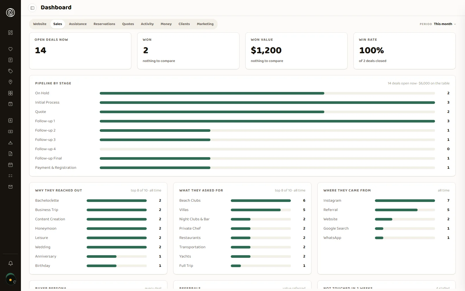
Un CRM de mercado está hecho para vender: todo cuelga del contacto y del negocio cerrado. Este está hecho para coordinar. El objeto central es el viaje, con todas sus reservas colgando de él, cada una con su proveedor, su horario y su comisión. Es la diferencia entre un embudo de ventas y una operación que hay que ejecutar sin que se caiga nada. An off-the-shelf CRM is built to sell: everything hangs off the contact and the closed deal. This one is built to coordinate. The central object is the trip, with all its bookings hanging off it, each with its vendor, its time and its commission. It is the difference between a sales funnel and an operation that has to be executed without dropping anything.
Todas las reservas de un viaje en una pantalla, con su estado. Nadie abre cinco fichas para saber cómo viene un fin de semana.Every booking on a trip in one screen, with its status. Nobody opens five records to see how a weekend is going.
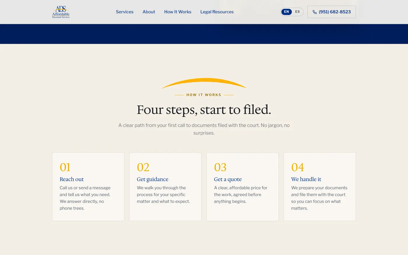
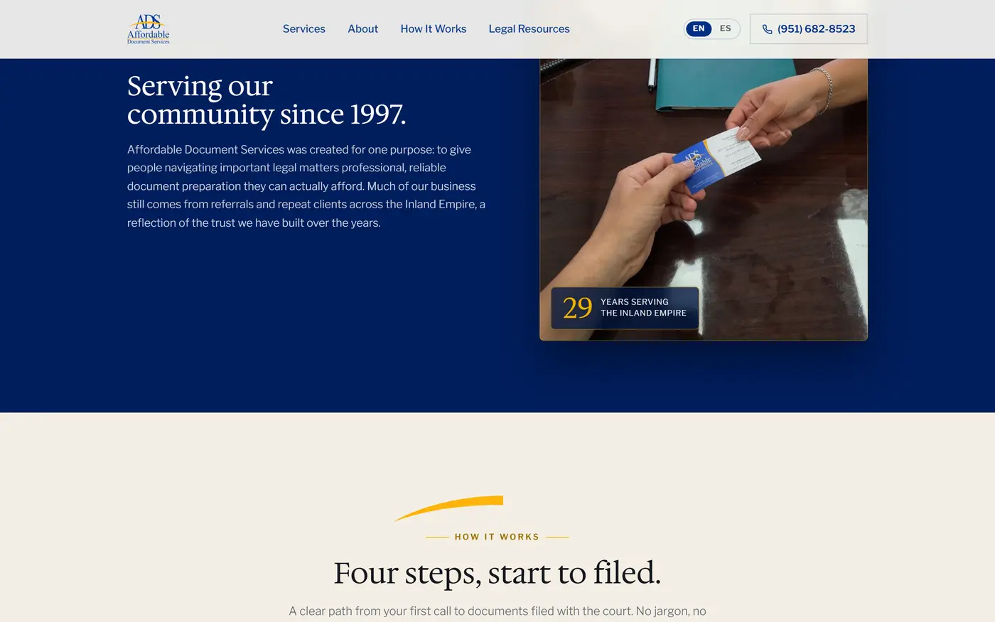
Una villa pide entrada y salida; un traslado, vuelo; un chef, menú y alergias. Cada tipo muestra lo suyo y nada más.A villa needs check-in and check-out; a transfer, a flight; a chef, menu and allergies. Each type shows its own fields and nothing else.
Cada servicio con su neto y su margen, y el total se calcula. Nadie escribe un número a mano.Each service with its net price and margin, and the total calculates itself. Nobody types a number by hand.
El valor de un viaje se calcula con honorarios más comisión de lo que efectivamente ocurrió, no con un campo que alguien completa.A trip’s value comes from fees plus commission on what actually happened, not from a field someone fills in.
Cada uno abre lo suyo y se actualiza solo, con reglas sobre qué se muestra y qué se queda la agencia.Each opens their own and it updates itself, with rules about what is shown and what the agency keeps.
Cliente y proveedor no son la misma ficha. Sin eso no se puede medir, ni filtrar, ni cobrar bien.A client and a vendor are not the same record. Without that you cannot measure, filter or bill properly.
Una planilla con varias monedas miente sin querer: cada vez que la abrís convierte todo al dólar de hoy, y el resultado de marzo cambia. Esta plataforma fija cada movimiento al cambio del día en que ocurrió. El pasado queda quieto. Y sobre esa base que no se mueve, en lugar de explicarte el mes que terminó, te muestra el que viene. A spreadsheet with several currencies lies without meaning to: every time you open it, it converts everything at today’s rate, and March’s result changes. This platform fixes every entry to the rate of the day it happened. The past holds still. And on that base that does not move, instead of explaining the month that ended, it shows you the one coming.
Cada movimiento queda fijado al tipo de cambio de su fecha. Cerrás marzo una vez y marzo no vuelve a moverse, aunque el dólar salte en abril.Every entry is fixed to the exchange rate of its date. You close March once, and March never moves again, even if the dollar jumps in April.
Tus cuentas y las de la empresa conviven en un solo lugar sin mezclarse nunca en el mismo número. Mirás solo la empresa, solo lo tuyo, o todo junto.Your accounts and the company’s live in one place without ever merging into the same figure. You look at the company, at yourself, or at both.
No solo qué pasó: si llegás a fin de mes, en qué semana se hace el pozo, y qué cambia si un cliente paga tarde o si sumás un gasto fijo.Not only what happened: whether you make it to month end, which week the hole opens, and what changes if a client pays late or you add a fixed cost.
Lo que planeaste y lo que gastaste, por categoría, en la misma pantalla. Te marca dónde te estás yendo mientras el mes corre, no cuando ya terminó.What you planned and what you spent, by category, on one screen. It flags where you are overrunning while the month is still running, not after it ended.
La factura queda pegada a su movimiento y el sistema le lee los datos en vez de que los tipees. Cuando alguien pide respaldo, no hay que salir a buscarlo.The invoice stays attached to its entry and the system reads its data instead of you typing it. When someone asks for backup, nobody goes hunting.
El paquete para el contador, con los movimientos del período y sus comprobantes, se arma solo. Nadie vuelve a rehacer la misma planilla.The package for the accountant, with the period’s entries and their receipts, assembles itself. Nobody rebuilds the same spreadsheet again.
Un negocio local casi siempre entra a la pelea con las reseñas en contra. R&R tenía siete; sus competidores 78, 110, 137 y 416. Ganar por cantidad no era una opción, así que se cambió la moneda de la prueba. Un sitio que muestra obra propia, credenciales verificables y el teléfono donde el cliente lo busca no compite por elogios: compite por evidencia. A local business almost always enters the fight outnumbered on reviews. R&R had seven; its competitors had 78, 110, 137 and 416. Winning on volume was not an option, so we changed the currency of proof. A site showing your own finished work, verifiable credentials and the phone where clients look for it does not compete on praise: it competes on evidence.
Antes de escribir una línea se audita qué muestra el resto del rubro en la zona. De ahí sale el terreno donde el negocio puede ganar, que casi nunca es el que el dueño supone.Before a line is written, we audit what the rest of the trade shows in the area. That is where the winnable ground appears, and it is rarely the one the owner assumes.
55 proyectos en seis categorías con filtros, de a seis por vez. El que entra ve obra terminada y elige mirar lo que se parece a lo suyo.55 projects across six categories with filters, six at a time. Visitors see finished work and choose to look at what resembles their own job.
Un cliente llegó con más de cien fotos de obra sacadas con teléfono y sin orden. Dos pasadas dejaron 54 en cuatro categorías: entra lo que prueba, sale lo que repite.One client arrived with over a hundred job-site photos shot on a phone, in no order. Two passes left 54 across four categories: what proves stays, what repeats goes.
En un caso se descartó la reserva de turnos online porque el dueño no atiende herramientas digitales, y todo se concentró en el teléfono. Un canal que nadie contesta espanta más de lo que trae.In one case online booking was dropped because the owner does not handle digital tools, and everything went to the phone. A channel nobody answers scares off more work than it brings.
El triage de un plomero son las cinco categorías que ya usaba por teléfono. Cada una manda la consulta con la dirección y la urgencia adentro, así la primera llamada no arranca de cero.A plumber’s triage is the five categories he already used on the phone. Each sends the enquiry with the address and urgency already in it, so the first call does not start from zero.
Las fotos de un sitio pasaron de 50,2 MB a 5,4 MB sin perder detalle. El sitio de un oficio se abre desde una obra o un estacionamiento, no desde una oficina con fibra.One site’s photos went from 50.2 MB to 5.4 MB with no loss of detail. A trade’s site gets opened from a job site or a parking lot, not from an office on fibre.
Un sitio corriente explica a qué se dedica una marca. Este tiene que demostrarlo antes de que alguien lea una palabra. Cuando competís por diseño, el sitio es la primera muestra de trabajo que ve un cliente: si se ve genérico, ya contestó la pregunta. Dirección visual propia, movimiento usado una sola vez y una pieza que no existe en ningún otro lado. An ordinary website explains what a brand does. This one has to prove it before anyone reads a word. When you compete on design, the site is the first piece of work a client sees: if it looks generic, it already answered the question. Its own visual direction, motion used once, and one piece that exists nowhere else.
El color no decora, ordena. En un sitio el celeste está 16 a 1 sobre el dorado, medido sobre la captura real del producto. En otro, el naranja marca una sola cosa: todo lo que se toca.Colour orders, it does not decorate. In one site the blue outweighs the gold 16 to 1, measured on the product’s own screenshot. In another, orange marks one thing only: everything you can touch.
En servicios legales la regulación prohíbe prometer resultados. El descargo obligatorio se diseñó como credencial visible en vez de letra chica, con papel crema y esquinas de 2 píxeles para no leerse como una app de consumo.In legal services, regulation forbids promising outcomes. The required disclaimer was designed as a visible credential instead of fine print, on cream paper with 2 pixel corners so it never reads as a consumer app.
En una agencia se descartaron cinco efectos para dejar uno. La apertura aterriza exactamente sobre el logo del encabezado, y recalcula el punto de llegada cada vez que cambia el alto de la pantalla.For one agency, five effects were cut so one could stay. The opening lands exactly on the header logo, and recalculates that landing point every time the screen height changes.
En un sitio el scroll avanza la decisión del usuario en cuatro etapas, revisada en diez puntos del recorrido. Es la parte que no sale de ninguna plantilla.In one site, scrolling moves the visitor’s decision through four stages, checked at ten points along the way. It is the part no template produces.
Un cliente no tenía con qué mostrar su app. Se resolvió dentro del propio sitio: nítido en cualquier pantalla, sin sesión de fotos y con costo de producción cero.One client had nothing to show their app with. It was solved inside the site itself: sharp on any screen, no photo shoot, zero production cost.
Cambiar de idioma no cambia solo el texto. En un caso cambia la vía por la que te contactan; en otro, cada idioma tiene su propia dirección. Dos mercados, no una traducción.Switching language does not just switch the text. In one case it switches how they reach you; in another, each language has its own address. Two markets, not a translation.
Acá no se arranca por la solución. Primero se define el problema, y recién después se decide qué construir. Antes de escribir una línea se audita lo que ya existe: en un CRM la pantalla mostraba 16.456 tareas y en el respaldo había una sola. Empezar por ahí cambia lo que se construye, y a veces cambia si vale la pena construirlo. This does not start from the solution. The problem gets defined first, and only then does anything get built. Before a line is written, whatever already exists gets audited: in one CRM the screen showed 16,456 tasks and the backup held exactly one. Starting there changes what gets built, and sometimes changes whether it is worth building at all.
En un sitio se armó a mano la equivalencia de 2.487 valores de filtro. La regla obvia habría cargado todo bajo el criterio equivocado, y nadie lo habría notado nunca.On one site, 2,487 filter values were mapped by hand. The obvious rule would have loaded everything under the wrong criterion, and nobody would ever have noticed.
Cuando una decisión se puede medir, se mide, y deja de depender del gusto de nadie. Es lo que evita las tres reuniones que no llegan a ninguna parte.When a decision can be measured, it gets measured, and stops depending on anyone’s taste. That is what avoids the three meetings that go nowhere.
Antes de gastar en producción se define cuántas piezas entran y cuándo se corta: tres pruebas, y si no salen dos utilizables se cierra ese camino. El presupuesto tiene un límite escrito, no una intención.Before spending on production, we define how many pieces are in and when we stop: three attempts, and if two usable ones do not come out, that path closes. The budget has a written limit, not an intention.
792 reservas pasaron con su viaje y su proveedor, sin una sola excepción. Antes de tocar nada hubo una corrida en seco de 5.171 filas. El negocio no paró un día.792 bookings moved with their trip and their vendor, without a single exception. Before anything was touched there was a dry run over 5,171 rows. The business did not stop for a day.
En un sitio que iba a terminar en el servidor de una familia, el formulario se hizo sin depender de servicios externos. Nadie hereda una cuenta ajena que un día deja de andar.On a site that was going to end up on a family’s own server, the form was built without depending on outside services. Nobody inherits someone else’s account that stops working one day.
Queda escrito el sistema: paleta, tipografía, escala de espaciado y criterio de uso. El equipo suma páginas nuevas sin volver a decidir nada ni volver a llamarme.The system is written down: palette, type, spacing scale and usage criteria. The team adds new pages without re-deciding anything, and without calling me again.